Appearance
Configure the grid layout
Baseline uses a grid layout to arrange your store's products and collections.
By arranging products and collections in a grid layout, Baseline makes navigating your store easy for visitors. Use Shopify's Theme editor to modify Baseline's settings to customize the grid's appearance.
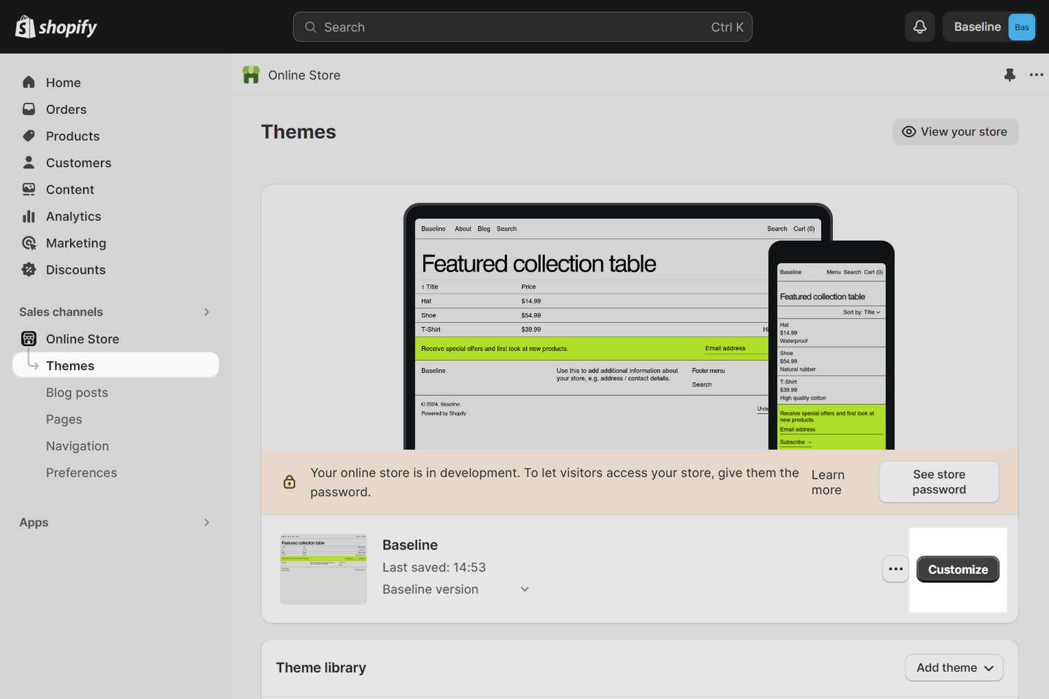
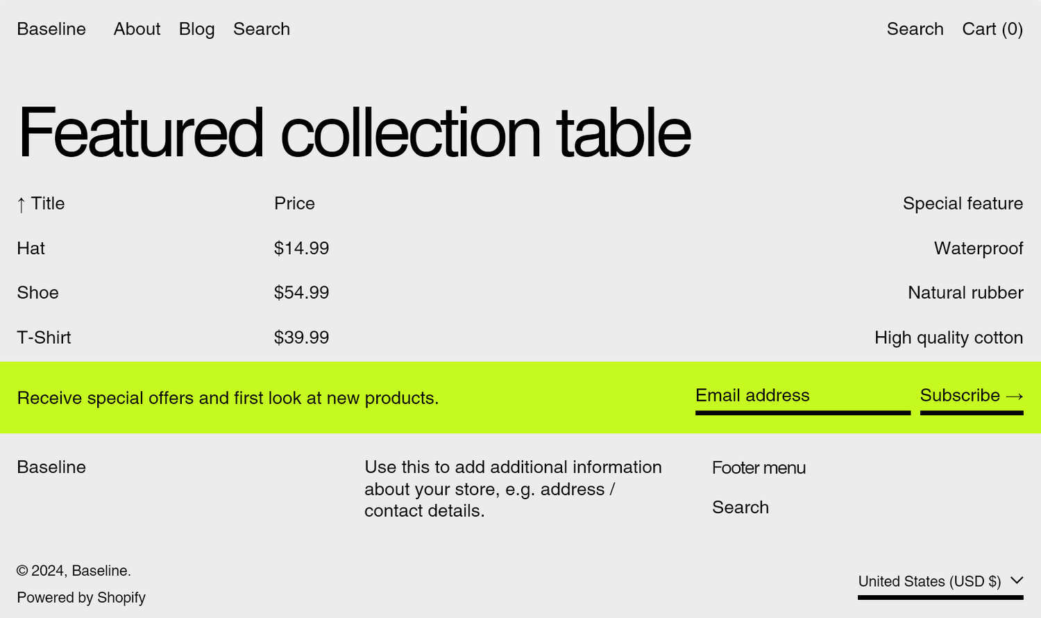
The previous image shows a Featured collection table section on a store's home page. The store's grid theme settings are applied to the grid border lines displayed between the table's rows and columns.
Access Theme editor's Theme settings
To access Theme editor's Theme settings:
In your store's Shopify admin, select Sales channels > Online store > Themes.
In the Themes pane, locate the version of Baseline you want to modify.
Beside the theme's name, select Customize to open Theme editor.
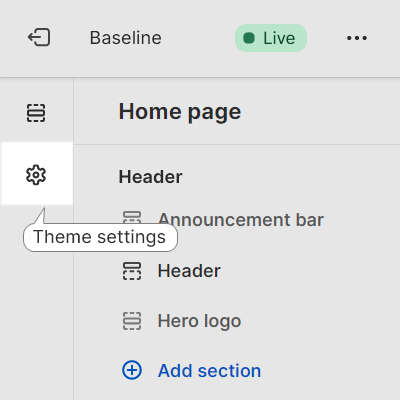
In Theme editor, select Theme settings (the "gears" icon).
When you're finished adjusting the theme, to avoid losing unsaved changes, select Save.

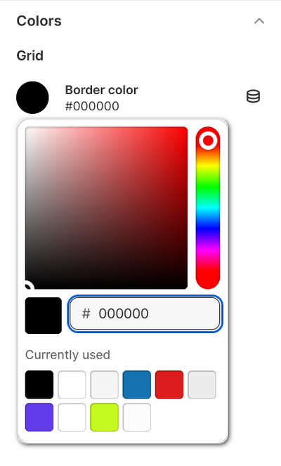
Set the grid's border color
To choose a color for the grid's borders:
In Theme editor, select Theme settings > Colors.
In the Color settings menu, locate the Grid > Border color menu area
Use one of the following methods to specify a color for the grid's borders.
- Choose a color with the Color picker.
- Enter a hexadecimal or hex color value. Refer to W3 Schools: Colors HEX.
- Select a Currently used color.
- Choose the Connect dynamic source icon.
Note
To colorize an element by using a color from a dynamic source, if available, select the Connect dynamic source icon beside the element selector, and then choose a dynamic source to add. To use this feature, you must define sources of dynamic content for colors. Refer to Shopify help: Metafields.
Select Save.
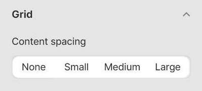
Adjust the spacing around content inside the grid
To adjust the spacing around content inside the grid:
In Theme editor, select Theme settings > Grid.
In the grid settings menu, use the Content spacing options to specify a setting for content spacing for the grid.
The setting provides the following content spacing options:
- None. With this option, no spacing is applied.
- Small. Applies a small amount of spacing.
- Medium. Applies medium spacing.
- Large. Sets spacing to the maximum amount.
TIP
By default, the Bold and Modern presets are set to Small spacing. The Minimal preset has Medium spacing.
Turn on or off spacing between the edges of images and the grid border
Complete the following steps to turn on or off spacing between the edges of images and the grid border.
In Theme editor, select Theme settings > Grid.
In grid settings menu, select the checkbox Fill images to grid border edge.
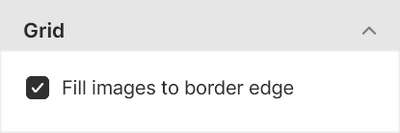
The checkbox provides the following options:
Onor "checked". Images fill the grid to the edge of the border.Offor "unchecked". Spacing or "padding" is applied between the images' edges and the grid borders.
Set the width of the grid's borders
To set the width of the grid's borders:
In Theme editor, select Theme settings > Grid.
Use the Border width slider to set the width of the grid border in pixels or
px. The slider ranges from0 pxto5 px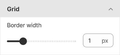
Example: Hide the grid border
The grid can't be removed, but the following settings make the grid less visible.
- Set the grid Border width to
0 px. - Set the grid Border color to the same color as your page's or section's background color (transparent).
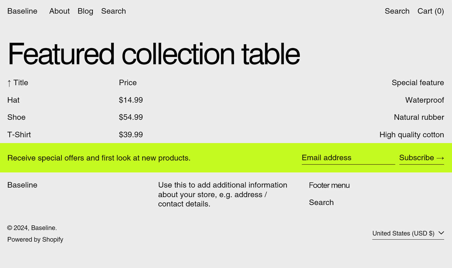
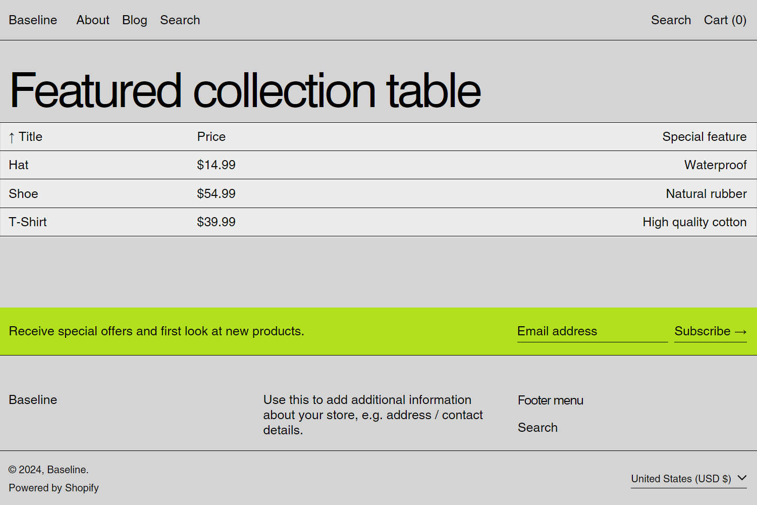
Example: Grid border width examples
The following grid border width and color settings provide interesting layouts. The settings are applied to a store's Featured collection table section. The section's table typically displays grid border lines between the table's rows and columns.
| Setting | Value |
|---|---|
| Grid border width | 5 px |
| Grid border color | Same color as your the section's background color (transparent). |
| Setting | Value |
|---|---|
| Grid border width | 0 px |