Appearance
Slideshow
This guide describes setting up the Slideshow section.
Use the section to display a series of images on a store page.
The previous video shows a Slideshow section on a store's home page. In the upper right, part of Theme editor's section menu is displayed. The menu's Auto-rotate slides option is set to on ("checked"). With this option enabled, the section automatically progresses to the next slide in the slideshow sequence. Note that enabling this option overlays the section with a play and pause button, and disables the dragging action to move between slides. In the upper left of the previous image the section's pause button is displayed.
For general guidance with modifying sections, refer to Sections overview, and Shopify help: Sections and blocks.
Set up a Slideshow section
To set up a Slideshow section:
Go to Customize theme.
In Theme editor, at the top of the page, use the dropdown to select a page that contains a Slideshow section.
Note
The section can be added into any page, except Checkout and Giftcard pages. To add the section into the current page, select Add section > Slideshow. Refer to Shopify help: Add a section.
From the side menu, select Slideshow.
Select a setting described in the following table.
| Setting name | Description |
|---|---|
| Height | Use the Height options to set a height for the section. The option Adapt to first slide sets the height to match the height of the first slide. The Full screen option uses the full height of the section. |
| Heading size | Use the Heading size setting to specify a size for the section's heading text. Set the section's heading text to use the same text size as Standard, Feature or Secondary heading text. Refer to Typography. |
| Auto-rotate slides | Select the Auto-rotate slides checkbox to turn on/off playing the section's slideshow automatically. Enabling this setting shows a play and pause button, and disables the dragging action to move between slides. |
| Change slides every | Use the Change slides every setting to specify the number of seconds to wait before showing the next slide. The options are 5, 6, 7, 8, 9, and 10 Seconds. To use this setting, enable the Auto-rotate slides option. |
| Color > Color scheme | Use the Color scheme options to select a color scheme for the section. Refer to Colors. |
| Color > Theme settings (link) | Follow the Theme settings link to open Theme editor's Color theme settings. Use the settings to edit the theme colors for your entire store. |
| Theme settings | If available, select Theme settings to access additional settings for the section. Refer to Section theme settings menu. |
| Custom CSS | Select Custom CSS. In the box, enter custom CSS styles to apply only to the current section. Refer to Shopify help: Add custom CSS. To apply custom styles to your entire online store, refer to Theme settings > Custom CSS. |
| Remove section | Select Remove section to delete the section from the current page. |
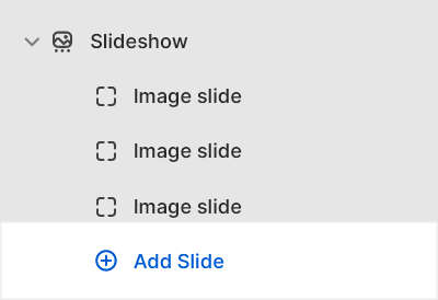
Configure a slide inside a Slideshow section
A default Slideshow section contains three Image slide blocks. To configure a block inside a Slideshow section:
Go to Customize theme.
In Theme editor, at the top of the page, use the dropdown to select a page that contains a Slideshow section.
From the side menu, expand the Slideshow section menu.
To configure an existing block, select the block from the side menu.
To add a new block, select Add slide, and then select the block you added.
Note
Inside the section, you can add, remove, show, hide, or move blocks. Refer to Configure blocks inside a section, and Shopify help: Sections and blocks.
Apply the block settings described in the following table.
| Setting name | Description |
|---|---|
| Image | Use the Image selector options to set up an image to display inside the block for desktop display devices. Refer to Add, replace or remove an image or video inside a section or block. The recommended image dimensions are 1800 x 800 pixels in .jpg format. |
| Image > Connect dynamic source | To display an image from a dynamic source for desktop displays, select the Connect dynamic source icon beside the Image selector, and then choose a metafield to add. Refer to Shopify help: Metafields. |
| Mobile image | Use the Mobile image selector options to set up an image to display inside the block for mobile display devices. Refer to Add, replace or remove an image or video inside a section or block. The recommended image dimensions are 800 x 1200 pixels in .jpg format. |
| Mobile image > Connect dynamic source | To display an image from a dynamic source for mobile displays, select the Connect dynamic source icon beside the Mobile image selector, and then choose a metafield to add. Refer to Shopify help: Metafields. |
| Indent image | Select the Indent image checkbox to add/remove a "whitespace" border around images inside the block. |
| Content > Heading | In the Heading box, enter text to display as a title inside the block. |
| Content > Text | In the Text box, enter (body) text to display inside the block. Format the text and add links using the Text editor pane. |
| Content > Text > Connect dynamic source | To display body text from a dynamic source, select the Connect dynamic source icon beside the Text box, and then choose a metafield to add. Refer to Shopify help: Metafields. |
| Content > Position | Select the Position options to specify a position for text inside the block. The options are: Top left, Top center, Top right, Left, Center, Right, Bottom left, Bottom center, and Bottom right. |
| Content > Width on desktop | Use the Width on desktop setting to specify a width for the block's content area. The options are One third, One half, Two thirds, and Full width. This setting applies to desktop display devices. |
| Call to action > Link | In the Link box, enter a URL for the block to use or select a link to a store page. |
| Call to action > Link > Connect dynamic source | To display a link from a dynamic source, if available, select the Connect dynamic source icon beside the Link box, and then choose a metafield to add. Refer to Shopify help: Metafields. |
| Call to action > Text | In the Text box, enter text to display as label text for the block's "Call to action" link. |
| Call to action > Style | Use the Style setting to specify a display style for the block's "Call to action" link. The Link option displays the "Call to action" link as a link. The Button option displays the "Call to action" link as a button. |
| Color > Color scheme | Use the Color scheme options to select a color scheme for the block. Refer to Colors. |
| Color > Theme settings (link) | Follow the Theme settings link to open Theme editor's Color theme settings. Use the settings to edit the theme colors for your entire store. |
| Color > Apply text color only | Select the Apply text color only checkbox to turn on/off "text color only" mode. With this setting enabled, only the text color from your chosen color scheme is applied to the block. |
| Remove block | Select Remove block to delete the block from the current section. |