Appearance
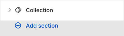
Collection
This guide describes setting up the Collection section.
Use the section to customize how a collection is displayed on a (default) Collection page.
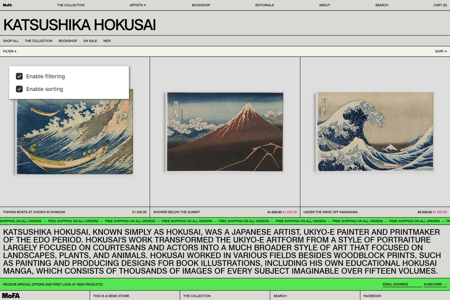
The previous image shows a Collection section on a store's Collection page. In the upper left, part of Theme editor's section menu is displayed. To show the product filtering and sorting options inside the section, the menu's Enable filtering and Enable sorting options are set to on ("checked"). With these options enabled, store visitors can arrange the products in the section's collection by specifying product filtering and sorting criteria.
For general guidance with modifying sections, refer to Sections overview, and Shopify help: Sections and blocks.
Set up a Collection section
To set up a Collection section:
Go to Customize theme.
In Theme editor, at the top of the page, use the dropdown to select the Collections > Default collection page.
Note
The section is available only on Collections > Default collection pages
From the side menu, select Collection.
Select a setting described in the following table.
| Setting name | Description |
|---|---|
| Hide title | Select the Hide title checkbox to show/hide the collection's title inside the section. |
| Image > Show collection image | Select the Show collection image checkbox to show/hide the collection's image inside the section. |
| Image > Indent image | Select the Indent image checkbox to add/remove a "whitespace" border around the collection image inside the section. |
| Image > Crop image | Use the Crop images options to set a cropping shape for the collection image inside the section. The options are No crop, Portrait, Square, Landscape, Super wide, and Letterbox. |
| Image > Image size on desktop | Use the Image size on desktop setting to specify a width for the collection image inside the section. The options are One third, One half, Two thirds, and Full width. This setting applies to desktop display devices. |
| Description > Description position | Use the Description position setting to specify a position for (collection) description text inside the section. The Under title option positions description text below the collection title. The After first row option positions description text below the first row of the collection's product tiles. The Bottom of page option positions description text below a the bottom of the section. |
| Description > Description color scheme | Use the Color scheme options to select a color scheme for the section's (collection) description text. Refer to Colors. To use this setting, set the Description position option to After first row or Bottom of page. |
| Description > Theme settings (link) | Follow the Theme settings link to open Theme editor's Color theme settings. Use the settings to edit the theme colors for your entire store. Only applies when after first row or bottom of page |
| Products > Product tile type | Select the Product tile type radio buttons to specify the type of product tile to display inside the section. The options are Standard or Text overlay. With Standard product tiles, product details, like product title and price, are displayed below the section's product images. With Text overlay product tiles, product details overlay the section's product images. |
| Products > Products per row | Adjust the Products per row slider to specify the number of collection products to display within each row inside the section. The minimum number is 2 products and the maximum is 5. This setting applies to desktop display devices. |
| Products > Rows | Adjust the Rows slider to specify the number of (product) rows to display inside the section. The minimum number is 1 row and the maximum is 8. |
| Products > Products per row on mobile | Use the Products per row on mobile radio buttons to specify the number of products to display in each row inside the section. The options are 1 and 2. This setting applies to mobile display devices. |
| Quick buy > Enable quick buy | Select the Enable quick buy checkbox to show/hide a "Choose options" button on product tiles inside the section. A store visitor uses the button to choose product options, like variants, to add to their cart. To use this option, set the Product tile type to Standard. |
| Quick buy > Button style | Use the Button style setting to specify a button style for the section's quick buy buttons. Apply your store's Primary or Secondary button style to the section's buttons. To use this option, set the Product tile type to Standard, and then check the Enable quick buy option (set to on). |
| Navigation > Collection menu | Use the Use the Collection menu selector to set up a menu to display inside the section. Refer to Set a menu for a Collection section. |
| Filtering and sorting > Enable filtering | Select the Enable filtering checkbox to show/hide the product filtering options inside the section. If enabled, visitors can select a range of products by using the section's filtering criteria. Refer to Shopify help: Add storefront filtering. |
| Filtering and sorting > Enable filtering > Customize filters (link) | Follow the Customize filters link to open the Navigation page in your store's Shopify admin. Use the page to configure filtering options for your store's collection and search filters. |
| Filtering and sorting > Enable sorting | Select the checkbox Enable sorting to show/hide the product sorting options inside the section. If enabled, visitors can arrange the products in the collection by using sorting criteria. |
| Filtering and sorting > Collapse filters | Select the Collapse filters checkbox to show/hide the product filtering options, by default, inside the section. With this option set to off, to access the product filtering options, visitors must select the expand menu icon inside the section. |
| Filtering and sorting > Capitalize labels | Select the Capitalize labels checkbox to turn on/off "uppercase mode". With this setting enabled, uppercase is applied to the text labels for the section's filtering and sorting options. To use this setting, set the Filters layout on desktop option to Drawer. |
| Filtering and sorting > Filters layout on desktop | Use the Filters layout on desktop options to specify a layout style for displaying the section's filtering and sorting options. Set the filtering and sorting options to display using a Dropdown, Sidebar or Drawer style layout. This setting applies to desktop display devices. The Drawer layout is the default layout for mobile display devices. |
| Color > Color scheme | Use the Color scheme options to select a color scheme for the section. Refer to Colors. |
| Color > Theme settings (link) | Follow the Theme settings link to open Theme editor's Color theme settings. Use the settings to edit the theme colors for your entire store. |
| Color > Use this color scheme for header and footer | Select the Use this color scheme for header and footer checkbox to turn on/off "header and footer color" mode. With this setting enabled, the color scheme you choose for the section is also applied to the current page's header and footer. |
| Theme settings | If available, select Theme settings to access additional settings for the section. Refer to Section theme settings menu. |
| Custom CSS | Select Custom CSS. In the box, enter custom CSS styles to apply only to the current section. Refer to Shopify help: Add custom CSS. To apply custom styles to your entire online store, refer to Theme settings > Custom CSS. |
Set a menu for a Collection section
To set up a menu to display inside a Collection section, apply the following section settings in Collection > Navigation > Collection menu.
If the section has no menu, to select a menu, choose Select menu. Enter the name of a menu into the Search box, or pick a menu from the list, and then choose Select.
To edit the current menu, select the menu link. The link opens the Navigation menu editor in Shopify admin. Use the editor to modify the menu. Refer to Shopify help: Add, remove, or edit menu items in your online store.
To create a new menu, select Change > Change menu, and then follow the Create menu link. The link opens the Navigation > Add menu page in Shopify admin. Use the menu editor to create a new menu, and then the select the new menu. Refer to Shopify help: Add, remove, or edit menu items in your online store.
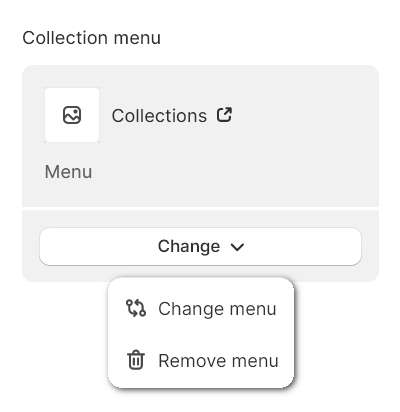
To replace the current menu, select Change > Change menu. Enter the name of the replacement menu into the Search box, or pick a replacement menu from the list, and then choose Select.
Configure a block within a Collection section
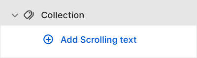
A default Collection section contains no Scrolling text blocks. To configure a Scrolling text block within a Collection section:
Go to Customize theme.
In Theme editor, at the top of the page, use the dropdown to select the Collections > Default collection page.
From the side menu, expand the Collection section menu.
To configure an existing block, select the block from the side menu.
To add a new block, select Add Scrolling text, and then select the block you added.
Note
Inside the section, you can add, remove, show, hide, and move blocks. Refer to Configure blocks inside a section, and Shopify help: Sections and blocks.
Select a block setting described in the following table.
| Setting name | Description |
|---|---|
| Position | Use the Position setting to specify a position for displaying the block inside the section. The Top option positions the block at the top of the section.The Under title option positions the block below the section's collection title. The After first row option positions the block below the first row of the section's product tiles. |
| Text | In the Text box, enter text to display as (scrolling) text inside the block. |
| Text > Connect dynamic source | To display (scrolling) text from a dynamic source, select the Connect dynamic source icon beside the Text box, and then choose a metafield to add. Refer to Shopify help: Metafields. |
| Link | In the Link box, enter a URL for the block to use, or select a link to a store page. |
| Link > Connect dynamic source | To display a link from a dynamic source, select the Connect dynamic source icon beside the Link box, and then choose a metafield to add. Refer to Shopify help: Metafields. |
| Mobile font size scale | Adjust the Mobile font size scale slider to set a font size for the block's text on mobile display devices. The minimum value is -2 and the maximum is 4. |
| Desktop font size scale | Adjust the Desktop font size scale slider to set a font size for the block's text on desktop display devices. The minimum value is -2 and the maximum is 9. |
| Font | Use the Font setting to specify a font for the block's text. Set the block's text to use the same font as Heading or Body text. |
| Speed | Adjust the Speed slider to specify a scroll speed between 20 and 400 (seconds) for the block's scrolling text. |
| Direction | Use the Direction setting to set the block's scrolling text to move from Right to left or Left to right. |
| Repeat text | Select the Repeat text checkbox to turn on/off "repeating text" mode. With repeating text mode enabled, text is scrolled across the block repeatedly. |
| Separator | Use the Separator setting to select a symbol to use between lines of repeatedly scrolling text. |
| Repeat separator | Adjust the Repeat separator slider to set how many scrolling text separator symbols are displayed between lines of repeatedly scrolling text. The slider ranges from 1 to 6. |
| Spacing between repeated separators | Use the Spacing between repeated separators setting to specify a style for the spacing that's applied between each scrolling text separator symbol. |
| Color > Color scheme | Use the Color scheme options to select a color scheme for the block. Refer to Colors. |
| Color > Theme settings (link) | Follow the Theme settings link to open Theme editor's Color theme settings. Use the settings to edit the theme colors for your entire store. |
| Remove section | Select Remove block to delete the block from the current section. |