Appearance
Feature text
This guide describes setting up a Feature text section.
Use the section to display text on a store page, with or without links and heading effects.
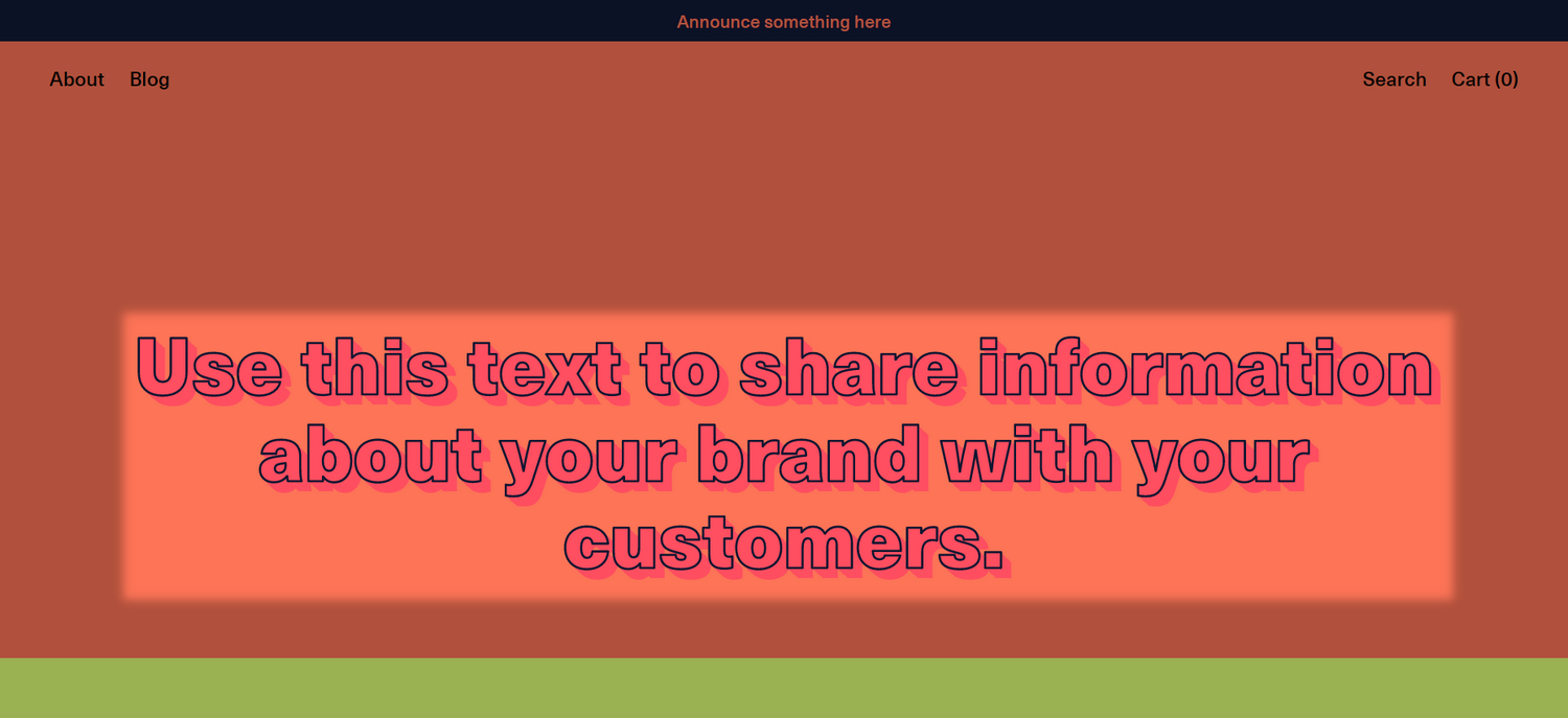
The previous image shows a Feature text section on a store's homepage, with the following settings:
In the section's settings, to display effects for the text inside the section, the checkbox Apply heading effects is set to
on. Refer to Heading effects.In Theme settings > Heading effects, to display an outline around the text characters, the Stroke > Thickness slider is set to
2px(pixels).To display a drop-shadow text effect, in Theme settings > Heading effects, the Shadow > Style dropdown is set to Full shadow.
For general guidance with modifying sections, refer to Sections overview, and Shopify help: Sections and blocks.
Set up a feature text section
To set up a Feature text section:
Go to Customize theme.
At the top of the page, use the dropdown to select a template that contains a Feature text section.
Note
The section can be added into any page, except Checkout and Giftcard pages. To add the section into the current page, select Add section > Feature text. Refer to Shopify help: Add a section.
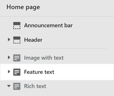
From the side menu, select Feature text.
Select a setting described in the following table.
| Setting name | Description |
|---|---|
| Text | In the Text box, enter text to display as (body) text inside the section. Format the text, and/ or add links, using the Text editor pane. |
| Text > Insert dynamic source | To display (body) text from a dynamic source, select the Insert dynamic source icon beside the Text box, and then choose a metafield to add. Refer to Shopify help: Metafields. |
| Mobile font size scale | Adjust the slider Mobile font size scale to set a default font size for heading text inside the section. The setting applies to mobile display devices. The minimum value is -2 and the maximum is 4. Refer to Shopify help: Customize your font sizes. |
| Desktop font size scale | Adjust the slider Desktop font size scale to set a default font size for heading text inside the section. The setting applies to desktop display devices. The minimum value is -2 and the maximum is 11. Refer to Shopify help: Customize your font sizes. |
| Desktop text size | Use the dropdown Desktop text size to set a size for (body) text inside the section. The options are: 2XL (two times extra large), 3XL (three times extra large), 4XL (four times extra large), 5XL (etc.), 6XL, 7XL, 8XL, and 9XL. This setting applies to desktop display devices. |
| Display on card | Select the checkbox Display on card to show/ hide a card behind the section. Refer to Shopify help: Cards. |
| Apply heading effects | Select the checkbox Apply heading effects to turn on/off effects for text inside the section. Refer to Heading effects. |
| Content width on desktop | Use the dropdown Content width on desktop to set a width for the section. The options are One third, One half, Two thirds, and Full width. This setting applies to desktop display devices. |
| Link > Button link | In the Button link box, enter a URL for the section's (optional) button to use or select a store page to link to. To remove a link, select the X icon inside the text box. To visit the link, select the Visit link icon above the Link box. |
| Link > Button link > Connect dynamic source | To display a link from a dynamic source, select the Connect dynamic source icon beside the Button link box, and then choose a metafield to add. Refer to Shopify help: Metafields. |
| Link > Label | In the Label box, enter text to display as a label for the section's (optional) button. To use this setting, add a URL or select a store page in the Button link box. |
| Color > Color scheme | Use the Color scheme dropdown to set the section's color scheme to Primary, Secondary, Tertiary or Quaternary. Refer to Colors. |
| Color > Use gradient for background | Select the checkbox Use gradient for background to turn on/ off using a gradient as the section's background. |
| Theme settings | If available, select Theme Settings to access additional settings for the section. Refer to Section theme settings menu. |
| Custom CSS | Select Custom CSS. In the box, enter custom CSS styles to apply only to the current section. Refer to Shopify help: Add custom CSS. To apply custom styles to your entire online store, refer to Theme settings > Custom CSS. |
| Remove section | Select Remove section to delete the section from the current page. |
Configure a block within a feature text section
A default Feature text section contains no blocks. To configure a block inside the section:
Go to Customize theme.
At the top of the page, use the dropdown to select a template that contains a Feature text section.
From the side menu, expand the Feature text section menu.
To configure an existing block, select the block from the side menu.
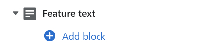
To add a new block, select Add block, choose a block to add, and then select the block you added.
Note
Inside the section, you can add, remove, show/ hide, or move blocks. Refer to Configure blocks inside a section, and Shopify help: Sections and blocks.
Apply a block setting described in the following table.
| Block name | Block description | Block setting(s) |
|---|---|---|
| Background pattern | Displays a stylistic pattern as a background inside the section. | Refer to Background pattern. |
| Background shape | Displays a stylistic shape as a background inside the section. | Refer to Background shape. |
| Sticker | Overlays the section with a stylized sticker. | Refer to Stickers. |
| Shape divider | Displays a stylized separator between the current section and the next/ previous section. | Refer to Shape divider. |