Appearance
Hero slideshow
This guide describes setting up the Hero slideshow section.
Use the section to display a series of images or videos (slides), at the top of a store page (hero), overlaid with text. Add videos from your store's media library or YouTube.
The previous video shows a Hero slideshow section in Theme editor, with the following settings:
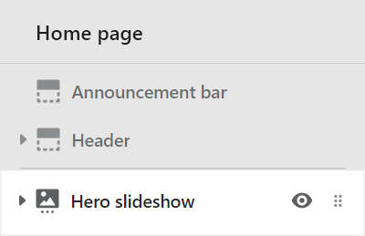
- On the left, the Hero slideshow section menu is displayed.
- In the section's menu, to progress the series of slides automatically, the checkbox option Auto-rotate slides is set to
on. - Note how enabling this option adds a slideshow play/pause button between the next/previous slide arrow icons.
- On the right, the section is displayed on a store's homepage.
- The Hero slideshow contains two Image slides (blocks).
- Each block's button is configured to link to a store collection page.
For general guidance with modifying sections, refer to Sections overview, and Shopify help: Sections and blocks
Set up a hero slideshow section
To set up a Hero slideshow section:
Go to Customize theme. At the top of the page, use the dropdown to select a template that contains a Hero slideshow section.
Note
The section can be added into any page, except Checkout and Giftcard pages. To add the section into the current page, select Add section > Hero slideshow. Refer to Shopify help: Add a section
From the side menu, select Hero slideshow.
Select a setting described in the following table.
| Setting name | Description |
|---|---|
| Slideshow style | Select the Slideshow style radio buttons to set the section's width to Inset or Full width. |
| Height | Use the Height dropdown to set the section's height. The options are:
|
| Display text overlay on cards | Select the checkbox Display text overlay on cards to show/ hide a card behind the section's text overlay area. Refer to Shopify help: Cards |
| Display content below image on mobile | Select the checkbox Display content below image on mobile to display the slide's overlay text below (on) or inside (off) the slide's image area. This setting applies to mobile display devices. |
| Auto-rotate slides | Select the checkbox Auto-rotate slides to turn/off automatic slideshow mode. With this option set to on the series of slides in the slideshow are progressed automatically. Enabling this option adds a slideshow play/pause button, between the next/previous slide arrow icons, inside the section, and disables dragging between slides. |
| Change slides every | Select the dropdown Change slides every to set a time for transitioning to the next/previous slide automatically. The options are 5 seconds, 6 seconds, 7 seconds, 8 seconds, 9 seconds, and 10 seconds. |
| Text overlay defaults > Content position | Select the Content position dropdown to set a position for the text overlay area inside the section. The dropdown options are:
|
| Text overlay defaults > Text alignment | Select the Text alignment dropdown to align text inside the text overlay area to the Left, Center, or Right. |
| Text overlay defaults > Heading size | Select the Heading size radio buttons to set the heading to use the same text size as Standard or Feature text. This setting applies to the heading inside the text overlay area. |
| Color > Color scheme | Use the Color scheme dropdown to set the color scheme for the section to Primary, Secondary, Tertiary, or Quaternary. Refer to Colors. |
| Color > Use gradient for background | Select the checkbox Use gradient for background to turn on/ off using a gradient as the section's background. |
| Theme settings | Select Theme settings to access additional settings for the section. Refer to Section theme settings menu. |
| Custom CSS | Select Custom CSS. In the box, enter custom CSS styles to apply only to the current section. Refer to Shopify help: Add custom CSS. To apply custom styles to your entire online store, refer to Theme settings > Custom CSS. |
| Remove section | Select Remove section to delete the section from the current page. |
Configure a block within a hero slideshow section
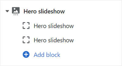
A default Hero slideshow section contains two slides (Slide - Image blocks). To configure a block inside the section:
Go to Customize theme. At the top of the page, use the dropdown to select a template that contains a Hero slideshow section.
From the side menu, expand the Hero slideshow section menu.
To configure an existing block, select the block from the side menu.
To add a new block, select Add block, choose a block to add, and then select the block you added.
Note
Inside a Hero slideshow section, you can add, remove, show/ hide, or move blocks. Refer to Configure blocks inside a section, and Shopify help: Sections and blocks
Apply a setting described in the Table: Hero slideshow blocks.
Table: Hero slideshow blocks
The following table describes the blocks inside the Hero slideshow section, and their corresponding settings.
The blocks indicated with an asterisk * are contained in a default Hero slideshow section. To configure a block, refer to Configure a block within a Hero slideshow section.
| Block name | Block description | Block setting(s) |
|---|---|---|
Slide - Image * | Displays an image, within a series of media (slides), overlaid with text. |
|
| Slide - YouTube | Displays a YouTube video, within a series of media (slides), overlaid with text. |
|
| Slide - Video | Displays a video from your store's media library, within a series of media (slides), overlaid with text. |
|
| Sticker | Overlays the section with a stylized sticker. | Refer to Stickers. |
| Shape divider | Displays a stylized separator between the current section and the next/ previous section. | Refer to Shape divider. |