Appearance
Comparison table
This guide describes setting up a Comparison table section. Use the section to display a table on a store page for comparing items, like product ingredients or features.
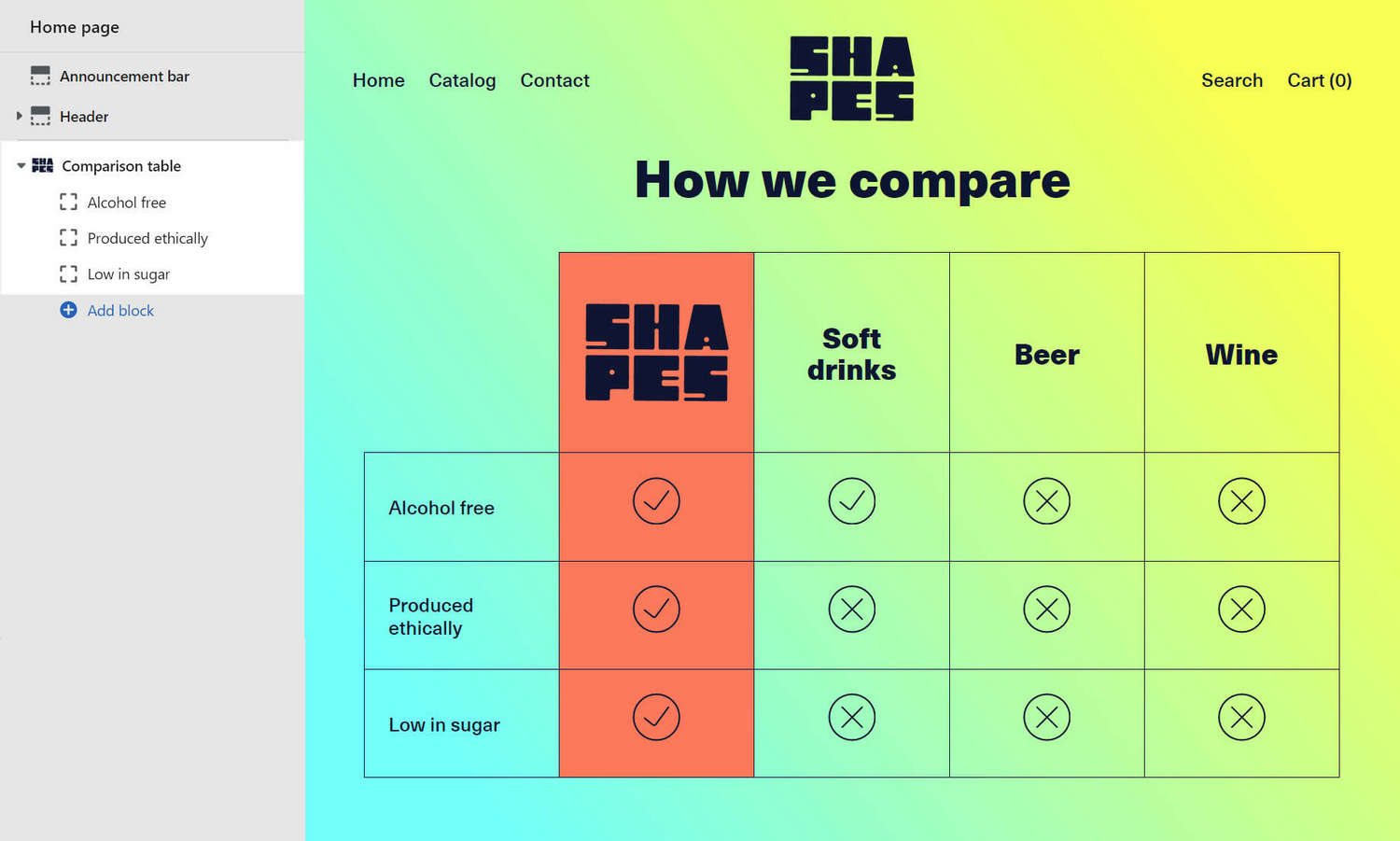
The previous image shows a Comparison table section in Theme editor with the following settings:
- On the left, the section menu has 3 rows (blocks).
- The rows are displayed inside the How we compare table, with 4 columns, on the right.
- An image is set up for the first column header.
- The icons inside the table cells provide a checklist for comparing product features.
For general guidance with modifying sections, refer to Sections overview and Shopify help: Sections and blocks.
Set up a comparison table section
To set up a comparison table section:
Go to Customize theme.
At the top of the page, use the dropdown to select a template that contains a comparison table section. For example, select Homepage.
Note
The comparison table section can be added into any page, except Checkout and Giftcard pages. To add a comparison table section into the current page, select Add section > Comparison table. Refer to Shopify help: Add a section.
From the side menu, select Comparison table.
Select a section setting described in the following table.
| Section setting name | Description |
|---|---|
| Display on card | Select the checkbox Display on card to show/ hide a card behind the section. Refer to Shopify help: Cards. |
| Title | In the Title box, enter text to display as a title inside the section. |
| Highlighted column | Use the Highlighted column setting to choose a table column to highlight. |
| Column 1 > Heading | In the Heading box, enter text to display as a heading for the first table column. |
| Column 1 > Image | Use the Image menu options to set an image as the heading for the first table column. Refer to Add, replace or remove an image or video inside a section or block. |
| Column 1 > Image > Connect dynamic source | To display an image from a dynamic source, select the Connect dynamic source icon beside the Image selector, and then choose a metafield to add. Refer to Shopify help: Metafields. |
| Provides the second table column with the same Heading and Image options as the first column. |
| Column 3 > Enable column | Select the Enable column 3 checkbox to show/ hide the third table column inside the section. |
| Provides the third table column with the same Heading and Image options as the first column. |
| Provides the fourth table column with the same visibility, Heading, and Image options as the third column. |
| Layout > Max width | Use the Max width setting to set a maximum width for content. The options are None (default), Small, Medium, and Large. |
| Color > Color scheme | Use the Color scheme dropdown to set the color scheme for the section to Primary, Secondary, Tertiary, or Quaternary. Refer to Colors. |
| Use gradient for background | Select the checkbox Use gradient for background to turn on/ off using a gradient as the section's background. |
| Highlighted column color | Select the Highlighted column color radio buttons to set a color for the highlighted column inside the section's table. Select the highlighted column to use the section color scheme's Accent 1 or Accent 2 color. |
| Theme settings | Select Theme settings to access additional settings for the section. Refer to Section theme settings menu. |
| Custom CSS | Select Custom CSS. In the box, enter custom CSS styles to apply only to the current section. Refer to Shopify help: Add custom CSS. To apply custom styles to your entire online store, refer to Theme settings > Custom CSS. |
| Remove section | Select Remove section to delete the section from the current page. |
Configure a block within a comparison table section
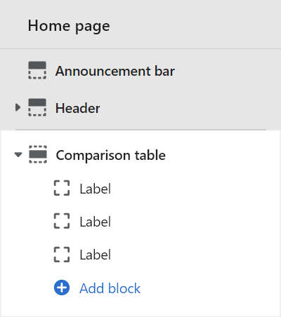
A default comparison table section contains three Row (Label) blocks. To configure a block inside the section:
Go to Customize theme.
At the top of the page, use the dropdown to select a template that contains a comparison table section.
From the side menu, expand the Comparison table section menu.
To configure an existing block, select the block from the side menu.
To add a new block, select Add block, choose a block to add, and then select the block you added.
Note
Inside a comparison table section, you can add, remove, show/ hide, or move blocks. Refer to Configure blocks inside a section, and Shopify help: Sections and blocks.
Apply a block setting described in the Table: Comparison table blocks.
Table: Comparison table blocks
The following table describes the blocks inside the comparison table section, and their corresponding settings. The blocks indicated with an asterisk * are contained in a default comparison table section. To configure a block, refer to Configure a block within a comparison table section.
| Block name | Block description | Block setting(s) |
|---|---|---|
Row * | Displays a table row inside the section. |
|
| Background pattern | Displays a stylistic pattern as a background inside the section. | Refer to Background pattern. |
| Background shape | Displays a stylistic shape as a background inside the section. | Refer to Background shape. |
| Sticker | Overlays the section with a stylized sticker. | Refer to Stickers. |
| Shape divider | Displays a stylized separator between the current section and the next/ previous section. | Refer to Shape divider. |