Appearance
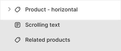
Product - horizontal
This guide describes setting up the Product - horizontal section.
Use the section to set what's displayed on Product > Horizontal gallery pages.
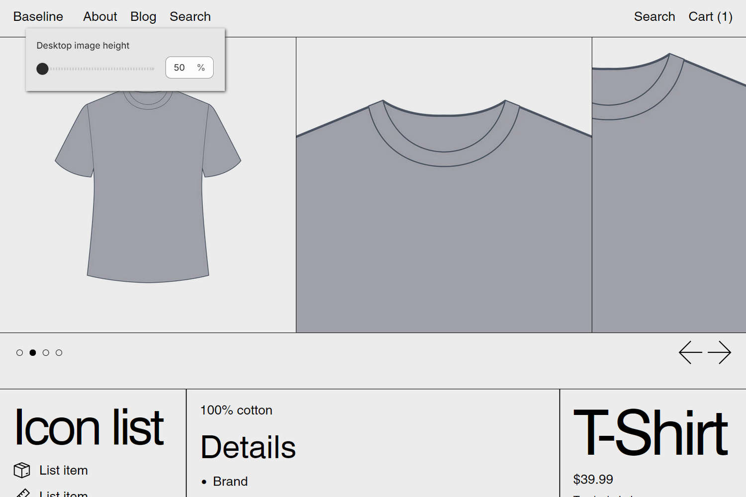
The previous image shows a Product - horizontal section on a store's Horizontal gallery (product) page. In the upper left, part of Theme editor's section menu is displayed. To specify a height for (product) images inside the section's media area on desktop display devices, the menu's Desktop image height option is set to 50 % (percentage of the overall section height).
For general guidance with modifying sections, refer to Sections overview, and Shopify help: Sections and blocks.
Set up a Product - horizontal section
To set up a Product - horizontal section:
Go to Customize theme.
In Theme editor, at the top of the page, use the dropdown to select Products > Horizontal gallery.
Note
The section is available only on Products > Horizontal gallery pages. To use the section, apply the Horizontal gallery template to a product. Refer to Shopify help: Apply a new template.
From the side menu, select Product - horizontal.
Select a setting described in the following table.
| Setting name | Description |
|---|---|
| Images > Desktop image height | Adjust the Desktop image height slider to set a height for the section's media area. The slider ranges from 50 % to 100 % (percentage of the overall section height). This setting applies to desktop display devices. |
| Images > Variant media change behavior | Use the Variant media change behavior setting to specify a behavior for the section's media area. The behavior applies when a store visitor selects a product variant inside the section.
|
| Images > Always show product featured media first | Select the Always show product featured media first checkbox to turn on/off "featured media first" mode. With this setting enabled, the section always displays a product's featured media first. |
| App blocks > App block area | Use the App block area setting to specify where app blocks are displayed inside the section. Set app blocks to display in the section's Social, Description, or Product form area. |
| Media > Media types (link) | Follow the Media types link to open the page Shopify help: Product media. Use the information on the page to learn about product media. |
| Media > Enable image zoom | Select the Enable image zoom checkbox to show/hide a panel that contains product images. The panel opens when a product's image is selected inside the section. The panel provides zoom in/out for images, arrow icons for navigating between images, and an X icon to close the panel. |
| Media > Enable video looping | Select the Enable video looping checkbox to turn on/off continuous replay for videos inside the section. With this setting off, the video plays once. Refer to Shopify help: Product media. |
| Color > Color scheme | Use the Color scheme options to select a color scheme for the section. Refer to Colors. |
| Color > Theme settings (link) | Follow the Theme settings link to open Theme editor's Color theme settings. Use the settings to edit the theme colors for your entire store. |
| Color > Use this color scheme for header and footer | Select the checkbox Use this color scheme for header and footer to turn on/off "header and footer color" mode. With this setting enabled, the color scheme you choose for the section is also applied to the current page's header and footer. |
| Theme settings | If available, select Theme settings to access additional settings for the section. Refer to Section theme settings menu. |
| Custom CSS | Select Custom CSS. In the box, enter custom CSS styles to apply only to the current section. Refer to Shopify help: Add custom CSS. To apply custom styles to your entire online store, refer to Theme settings > Custom CSS. |
Configure a block within a Product - horizontal section
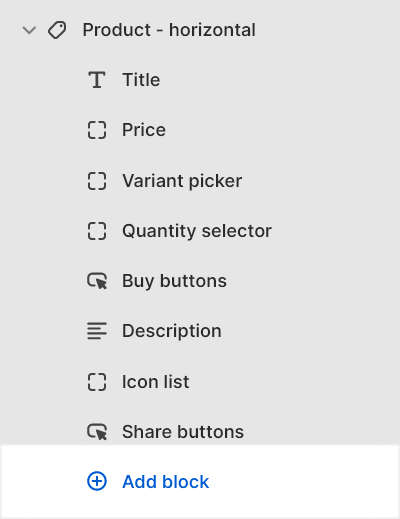
A default Product - horizontal section contains eight Product blocks. To configure a block inside the section:
Go to Customize theme.
In Theme editor, at the top of the page, use the dropdown to select Products > Horizontal gallery.
From the side menu, expand the Product - horizontal section menu.
To configure an existing block, select the block from the side menu.
To add a new block, select Add block, choose a block to add, and then select the block you added.
Note
Inside the section, you can add, remove, show, hide, and move blocks. Refer to Configure blocks inside a section, or Shopify help: Sections and blocks.
Apply a block setting described in the Table: Product - horizontal blocks.
Table: Product - horizontal blocks
The following table describes the blocks inside the Product - horizontal section, and their corresponding settings.
Some blocks have No customizable settings available. The blocks indicated with an asterisk * are contained in a default Product - horizontal section. To configure a block, refer to Configure a block within a Product - horizontal section.
| Block name | Block description | Block setting(s) |
|---|---|---|
Title * | Displays a product's title inside the section. | There are no customizable settings available for this block. |
Price * | Displays a product's price inside the section. |
|
Variant picker * | Displays a product options or "variant" picker for choosing variations of a product, inside the section. |
|
Quantity selector * | Displays a quantity selector, inside the section, for choosing the number of products to purchase. | There are no customizable settings available for this block. |
Buy buttons * | Displays the Add to cart and Buy it now buttons inside the section. |
|
Description * | Displays a text area to contain a product's description text inside the section. |
|
Icon list * | Displays a list of items with icons, inside the section. |
|
Share buttons * | Displays an area, inside the section, with buttons for sharing links to your store's products via social media. Refer to Social media. |
|
| Vendor | Displays the name of a product's vendor inside the section. | There are no customizable settings available for this block. |
| Complementary products | When a customer selects a product from your store, the block displays related products inside the section. To setup complementary products, install the Shopify search & discovery app, and refer to Shopify developer help: Product recommendations. |
|
| Inventory status | Displays a text indicator of a product's availability, inside the section. |
|
| Location inventory status | Displays the quantity of a product that's available in each of your store's inventory locations, inside the section. |
|
| Text | Displays a text area to contain additional product information, inside the section. |
|
| Rich text | Displays an area with formatted text and links inside the section. |
|
| Information list | Displays additional product information inside the section, using a table or list layout. |
|
| Collapsible tab | Displays a text area with expandable tabs, to contain additional product information, inside the section. |
|
| Popup | Displays a popup overlay to contain additional product information, inside the section. |
|
| Share | Displays an area, inside the section, with buttons for sharing links to your store's products via social media. Refer to Social media. | There are no customizable settings available for this block. |
| Custom Liquid | Displays advanced customizations from Liquid code, like app snippets, inside the section. |
|