Appearance
Product grid tiles
This guide describes the Theme settings > Product grid tiles menu options.
Use the settings to specify how product tiles (images) are displayed inside Baseline's grid. The grid contains the elements of your store, like product tiles and sections.
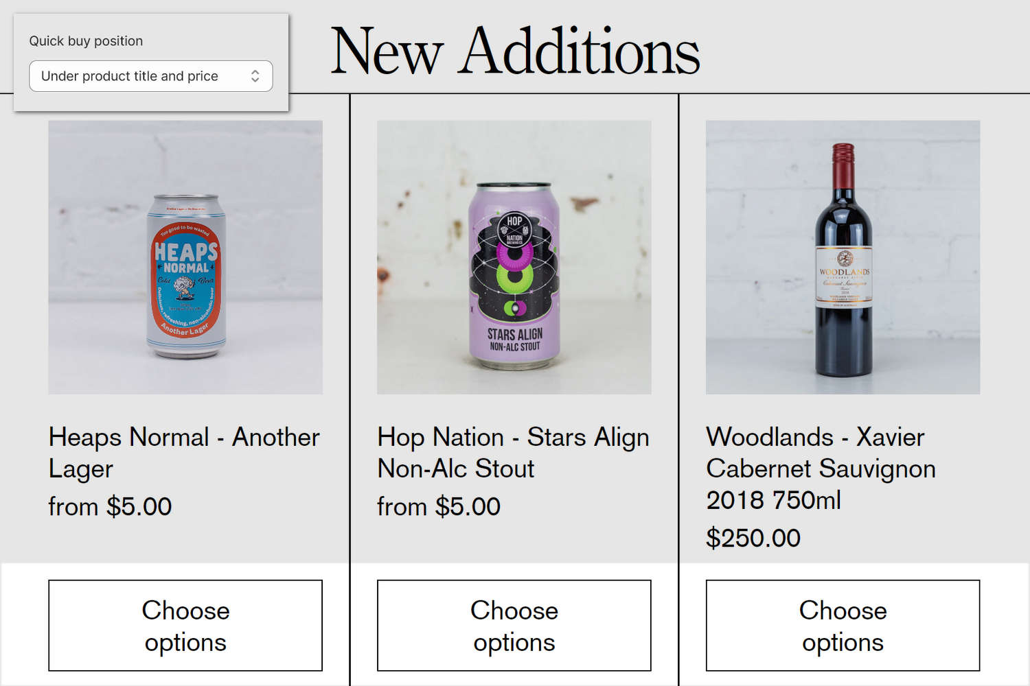
The previous image shows a New additions collection on a store's home page. On the page, product grid tiles display three products from the collection. In the upper left, part of Theme editor's Theme settings > Product grid tiles menu is displayed. The menu's Quick buy position option is set to Under product title and price. Inside the tile for each product, this option positions the Choose options (Quick buy selector) below the product's title text and price.
For general guidance with adjusting a theme setting, refer to Settings overview and Shopify help: Theme settings.
Set up product grid tiles
To set up product grid tiles:
In Theme editor, go to Theme settings > Product grid tiles.
Select a setting described in the following table.
| Setting name | Description |
|---|---|
| Show vendor | Select the Show vendor checkbox to turn show/hide the names of product vendors inside product tiles. |
| Show on sale badge | Select the Show on sale badge checkbox to show/hide "on sale" badges. The badges are displayed inside product tiles for store products listed as "on sale". |
| Show sold out badge | Select the Show sold out badge checkbox to show/hide "sold out" badges. The badges are displayed inside product tiles for store products that are not in stock (listed as "sold out"). |
| Grid image size | Use the Grid image size options to specify a size for product tile images inside the product grid. The options are Natural, Square (1:1), Landscape (4:3), and Portrait (2:3). |
| Grid image crop style | Select the Grid image crop style radio buttons to set a cropping style for product tile images inside the grid. The options are Fit and Fill. |
| Show second image on hover | Select the Show second image on hover checkbox to show/hide a second product image. The second product image displays when the cursor is placed over a product tile ("mouse over") inside the grid. |
| Standard > Title and price text alignment | Use the Title and price text alignment setting to specify a position for product title text and price text inside product grid tiles. The options are "Title left, price right", "Title left, price underneath", and "Title center, price right". To apply these options to a particular Product or Collection section, in the section's settings menu, set the Product tile type option to Standard. Standard product tiles support quick buy and color swatches. |
| Standard > Quick buy position | Use the Quick buy position setting to specify a position for the Quick buy selector inside product grid tiles. The options are "Over image", and "Under product title and price". To apply these options to a particular Product or Collection section, in the section's settings menu, enable the Quick buy checkbox option, and then set the Product tile type option to Standard. Standard product tiles support quick buy and color swatches. |
| Text overlay > Product title and price display | Use the Product title and price display setting to specify a position for overlaid product title text and overlaid price text inside product grid tiles. The options are "Over image, aligned bottom", "Over image, aligned top", and "Over image, on hover". To apply these options to a particular Product or Collection section, in the section's settings menu, set the Product tile type option to Text overlay. Text overlay product tiles do not support quick buy or color swatches. |