Skip to content

Product pages

This guide describes setting up the Product pages section.

Use the section to set what's displayed on a (default) Product page when a visitor selects a product from your store.

An example Product pages section on a store's Product page.

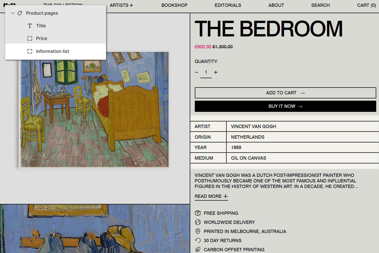
​The previous image shows a Product pages section on a store's default Product page. In the upper left, part of Theme editor's section menu is displayed. In the menu, an Information list block is added into the section. On the right, the block applies a table layout to display information about the product, including the artist's name and country of origin.

For general guidance with modifying sections, refer to Sections overview, and Shopify help: Sections and blocks.

Set up a Product pages section

To set up a Product pages section:

  1. Go to Customize theme.

    In Theme editor, at the top of the page, use the dropdown to select Products > Default product.

    Note

    The section is available only on the Products > Default product page.

  2. From the side menu, select Product pages.

    The Product pages section selected in Theme editor.

  3. Select a setting described in the following table.

Setting nameDescription
Desktop media widthUse the Desktop media width setting to specify a width for the section's media area. The options are One third, One half, Three fifths, and Two thirds. This setting applies to desktop display devices.
Desktop media positionUse the Desktop media position setting to position the section's media area on the Left or Right. This setting applies to desktop display devices.
Enable two media per row on desktopSelect the Enable two media per row on desktop checkbox to turn on/off "Two media per row" mode. With this setting enabled, two (product) media items are displayed in each row inside the section's media area. For a product with an odd number of media items, the section displays the product's first media item at full width. This setting applies to desktop display devices.
Full width first media on desktopSelect the Full width first media on desktop checkbox to turn on/off "Full width first media" mode. With this setting enabled, the section displays a product's first media item at full width. This setting applies to desktop display devices.
Variant media change behavior on desktopUse the Variant media change behavior on desktop setting to specify a behavior for the section's media area. The behavior applies when a store visitor selects a product variant inside the section. This setting applies to desktop display devices.
  • With the Single variant mode option, the section's media area displays a single (product) media item only. The item that's displayed is the first product media item associated with the currently selected product variant. When a store visitor selects a different product variant, the item that's displayed changes to match the newly selected variant. By default, Single variant mode applies to products with no variants.
  • With the Swap first media option, the section's media area displays (product) media items for all variants - arranged a column layout. The item displayed at the top of the column is the first product media item that's associated with the currently selected product variant. When a store visitor selects a different product variant, the item displayed at the top of the column changes to match the newly selected variant.
  • With the Scroll to media option, the section's media area displays (product) media items for all variants - arranged a column layout. The item displayed at the top of the column is the first product media item that's associated with the currently selected product variant. When a store visitor selects a different product variant, a scroll animation effect moves to display the first media item that's associated with the newly selected variant.
Always show product featured media firstSelect the Always show product featured media first checkbox to turn on/off "featured media first" mode. With this setting enabled, the section always displays a product's featured media first.
Enable multiple variant mediaSelect the Enable multiple variant media checkbox to show/hide multiple media inside the section for products with variants.
Media > Media types (link)Follow the Media types link to open the page Shopify help: Product media. Use the information on the page to learn about product media.
Media > Enable image zoomSelect the Enable image zoom checkbox to show/hide a panel that contains product images. The panel opens when a product's image is selected inside the section. The panel provides zoom in/out for images, arrow icons for navigating between images, and an X icon to close the panel.
Media > Enable video loopingSelect the Enable video looping checkbox to turn on/off continuous replay for videos inside the section. With this setting off, the video plays once. Refer to Shopify help: Product media.
Product form area > Max width of contentUse the Max width of content setting to apply a Full, Wide or Narrow width to content inside the section's product form (product details area).
Color > Color schemeUse the Color scheme options to select a color scheme for the section. Refer to Colors.
Color > Theme settings (link)Follow the Theme settings link to open Theme editor's Color theme settings. Use the settings to edit the theme colors for your entire store.
Use this color scheme for header and footerSelect the checkbox Use this color scheme for header and footer to turn on/off "header and footer color" mode. With this setting enabled, the color scheme you choose for the section is also applied to the current page's header and footer.
Theme settingsIf available, select Theme settings to access additional settings for the section. Refer to Section theme settings menu.
Custom CSSSelect Custom CSS. In the box, enter custom CSS styles to apply only to the current section. Refer to Shopify help: Add custom CSS. To apply custom styles to your entire online store, refer to Theme settings > Custom CSS.

Configure a block within a Product pages section

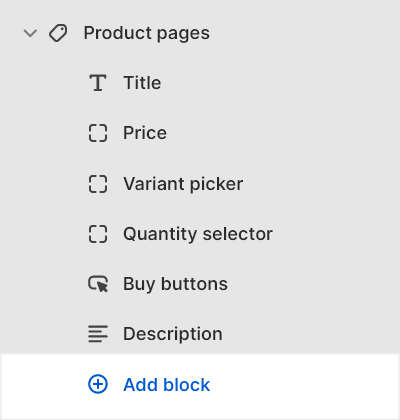
A default Product pages section contains six product blocks. To configure a block inside the section:

  1. Go to Customize theme.

    In Theme editor, at the top of the page, use the dropdown to select the Products > Default product page.

  2. From the side menu, expand the Product pages section menu.

  3. To configure an existing block, select the block from the side menu.

    To add a new block, select Add block, choose a block to add, and then select the block you added.

    The add block options for the product pages section in Theme editor.

    Note

    Inside the section, you can add, remove, show/hide, or move blocks. Refer to Configure blocks inside a section, or Shopify help: Sections and blocks.

  4. Apply a block setting described in the Table: Product pages blocks.

Table: Product pages blocks

The following table describes the blocks inside the Product pages section, and their corresponding settings.

Some blocks have No customizable settings available. The blocks indicated with an asterisk * are contained in a default Product pages section. To configure a block, refer to Configure a block within a Product pages section.

Block nameBlock descriptionBlock setting(s)
Title *Displays a product's title inside the section.There are no customizable settings available for this block.
Price *Displays a product's price inside the section.
  • Use the Font and text size setting to specify a font and text size for the block's (price) text. Set the block's text to use the same font and text size as Body text. Alternatively, set the block's text to use the same font and text size as Standard, Feature or Secondary heading text. Refer to Typography.
  • Select Remove block to delete the block from the section.
Variant picker *Displays a product options or "variant" picker for choosing variations of a product, inside the section.
  • Use the Options style setting to specify a style for displaying the product options picker inside the block.
  • Select the Hide option labels checkbox to show/hide text labels for product options inside the block.
  • Select the Hide sold out variants checkbox to show/hide product variants that are out of stock (or "sold out") inside the block.
  • Select the Hide unavailable variants checkbox to show/hide product variants, inside the block, that are not available for purchase.
  • Select Remove block to delete the block from the section.
Quantity selector *Displays a quantity selector, inside the section, for choosing the number of products to purchase.There are no customizable settings available for this block.
Buy buttons *Displays the Add to cart and Buy it now buttons inside the section.
  • Select the checkbox Show dynamic checkout button to show/hide a button with the customer's preferred payment method, beside the Add to cart button, inside the block. Refer to Shopify help: Dynamic checkout buttons.
  • Select the checkbox Show pickup availability to show/hide indicators, inside the block, for products that can be collected from your store's designated customer "pick up" locations. Refer to Shopify help: Show pickup availability to your customers.
  • Select the checkbox Show recipient information form for gift card products to show/hide the recipient information form. With this setting enabled, visitors who purchase a gift card from your store can use the form to send the gift card by providing the recipient's email address. Visitors can also enter a personal message, and send the message to the gift card's recipient. Refer to Add recipient fields to your gift card product.
  • Select Remove block to delete the block from the section.
Description *Displays a text area to contain a product's description text inside the section.
  • Select the Enable collapsible tabs checkbox to turn on/off "collapsible tab" mode for the block's content. With this setting enabled, level two <h2> headings in the product description text are displayed using collapsible tabs with an expandable text area for corresponding body text.
  • Select the Truncate description checkbox to show/hide a Read more button, inside the block. Selecting the button opens an expanded text area that contains a product's description text. Enable this setting for products with variant images and longer descriptions. To use this setting, set collapsible tabs to off.
  • Adjust the Maximum words before truncation slider to specify a maximum number of words to display from the product's description text before the block displays truncated text. The slider ranges from 10 to 100.
  • Select Remove block to delete the block from the section.
VendorDisplays the name of a product's vendor inside the section.There are no customizable settings available for this block.
Complementary productsWhen a customer selects a product from your store, the block displays related products inside the section. To setup complementary products, install the Shopify search & discovery app, and refer to Shopify developer help: Product recommendations.
  • In the Heading text box, enter text to display as title text inside the block.
  • To display heading text from a dynamic source, if available, select the Connect dynamic source icon, beside the Heading box, and then choose a dynamic source to add. Refer to Shopify help: Metafields.
  • Use the Heading text style setting to specify a font for the block's heading text. Set the block's heading text to use the same style as Heading or Body text.
  • Select the Product tile type radio buttons to specify the type of product tile to display inside the block. The options are Standard or Text overlay. With Standard product tiles, product details, like product title and price, are displayed below the block's product images. With Text overlay product tiles, product details overlay the block's product images.
  • Adjust the slider Maximum products to show to set the total number of products to display inside the block. The minimum number is 1, and the maximum is 10.
  • Use the Products per row on desktop options to set the number of products to show in each row, within the block, on desktop display devices. The options are 2 or 3. This setting applies to desktop display devices.
  • Use the Products per row on mobile options to set the number of products to show in each row, within the block, on mobile display devices. The options are 1 or 2. This setting applies to desktop display devices.
  • Select the Enable quick buy checkbox to show/hide a "Choose options" button on product tiles inside the block. A store visitor uses the button to choose product options, like variants, to add to their cart. To use this option, set the Product tile type to Standard.
  • Use the Button style setting to specify a button style for the block's quick buy buttons. To use this option, set the Product tile type to Standard, and then check the Enable quick buy option (set to on).
  • Select Remove block to delete the block from the section.
Inventory statusDisplays a text indicator of a product's availability, inside the section.
  • Adjust the Low inventory threshold slider to set a value between 0 and 100. When the in-stock quantity of a product is greater than the slider value, the text Ready to ship is displayed inside the block. Otherwise, the block displays the text "Only n in stock". n is the in-stock quantity of the product.
  • Select the Show inventory count checkbox to show/hide a count of remaining stock inside the block after the Low inventory threshold is exceeded. With is option enabled, the block displays the text "Only n in stock". n is the in-stock quantity of the product.
  • Select Remove block to delete the block from the section.
Location inventory statusDisplays the quantity of a product that's available in each of your store's inventory locations, inside the section.
  • Select the Locations to show radio buttons to specify the inventory locations to use for displaying the quantity of available product. The options are All locations or In stock locations only. Refer to Shopify help: Assigning inventory to locations.
  • Select Remove block to delete the block from the section.
TextDisplays a text area to contain additional product information, inside the section.
  • In the Text box, enter text to display inside the block. Format the text and add links using the Text editor pane.
  • To display text from a dynamic source, if available, select the Connect dynamic source icon beside the Text box, and then choose a metafield to add. Refer to Shopify help: Metafields.
  • Use the Font setting to specify a font for the block's text. Set the block's text to use the same font as Heading or Body text.
  • Use the Text size setting to specify a size for the block's text. Set the block's text size to one of the following options:
    • S = small
    • M = medium
    • M / desktop L = medium on mobile displays devices, and large on desktop displays devices
    • M / desktop XL = medium on mobile, and extra large on desktop
    • M / desktop 2XL = medium on mobile, and two times extra large on desktop
  • Use the Icon setting to choose a graphical icon to display inside the block. For example, select the Box, Check mark, Like, Map pin, or Star icon. For no icon, select None (default).
  • Select Remove block to delete the block from the section.
Rich textDisplays an area with formatted text and links inside the section.
  • In the Text box, enter text to display inside the block. Format the text or add a link using the Text editor pane.
  • To display text from a dynamic source, like product Title or Vendor, select the Insert dynamic source icon, beside the Text box, and then choose a metafield to add. Refer to Shopify help: Metafields.
  • Select Remove block to delete the block from the section.
Information listDisplays additional product information inside the section, using a table or list layout.
  • In the Text box, enter text to display inside the block. Format the text or add a link using the Text editor pane. For a list layout, add each list item on a new line. For a table layout, add each row item on a new line. To specify data for your table's headers and rows, apply the format the Label: Content to your text.
  • To display text from a dynamic source, like product Title or Vendor, select the Insert dynamic source icon, beside the Text box, and then choose a metafield to add. Refer to Shopify help: Metafields.
  • Use the Font setting to specify a font for the block's text. Set the block's text to use the same font as Heading or Body text.
  • Use the Text size setting to specify a size for the block's text. Set the block's text size to one of the following options:
    • S = small
    • M = medium
    • M / desktop L = medium on mobile displays devices, and large on desktop displays devices
    • M / desktop XL = medium on mobile, and extra large on desktop
    • M / desktop 2XL = medium on mobile, and two times extra large on desktop
  • Use the Style setting to specify a layout style for the block's text. Apply a Table (no borders/gridlines), Table with gridlines, or List layout to the block.
  • Select Remove block to delete the block from the section.
Collapsible tabDisplays a text area with expandable tabs, to contain additional product information, inside the section.
  • In the Heading box, enter text to display as the block's title text.
  • To display heading text from a dynamic source, select the Insert dynamic source icon beside the Heading box, and then choose a metafield to add. Refer to Shopify help: Metafields.
  • Use the Heading text style setting to specify text a style for the block's title text. Set titles to use the same font as Heading or Body text.
  • In the Tab content box, enter text to display inside the block. Format the text and add links using the Text editor pane.
  • To display tab content from a dynamic source, select the Insert dynamic source icon beside the Tab content box, and then choose a metafield to add. Refer to Shopify help: Metafields.
  • Use the selector Tab content from page > Select page to add content from another store page into the block.
  • To display page content from a dynamic source, select the Connect dynamic source icon beside the selector, and then choose a dynamic source to add. You must define sources of dynamic content. Refer to Shopify help: Metafields
  • Select the Icon options to choose a graphical icon to display beside the block's title text. For example, select the Box, Check mark, Map pin, Price tag, or Star icon. For no icon, select None (default).
  • Select Remove block to delete the block from the section.
Icon listDisplays a list of items with icons, inside the section.
  • In the Heading box, enter text to display as the block's title.
  • To display heading text from a dynamic source, select the Insert dynamic source icon beside the Heading box, and then choose a metafield to add. Refer to Shopify help: Metafields.
  • Use the Text color setting to specify a color for text inside the block. Set the block's text to use the section color scheme's Text or Secondary color.
  • For list items 1 to 5, in the Item # > Text box, enter text to display beside an item inside the block.
  • For items 1 to 5, to display item text from a dynamic source, select the Insert dynamic source icon beside the Text box, and then choose a metafield to add. Refer to Shopify help: Metafields.
  • For list items 1 to 5, use the Item # > Icon options to choose a graphical icon to display beside the item's text, inside the block. For example, select the Box, Check mark, Map pin, Price tag, or Star icon. For no icon, select None (default).
  • Select Remove block to delete the block from the section.
PopupDisplays a popup overlay to contain additional product information, inside the section.
  • Use the Icon options to choose a graphical icon to display beside the text, inside the block. For example, select the Box, Check mark, Map pin, Price tag, or Star icon. For no icon, select None (default).
  • In the Link label box, enter label text for the link to use inside the block. When the link is selected, a popup overlay is displayed.
  • To display Link label text from a dynamic source, select the Insert dynamic source icon beside the Link label box, and then choose a metafield to add. Refer to Shopify help: Metafields
  • Use the selector Page > Select page to add content from another store page into the block.
  • To display page content from a dynamic source, select the Connect dynamic source icon beside the Page selector, and then choose a dynamic source to add. You must define sources of dynamic content. Refer to Shopify help: Metafields.
  • Use the Text color setting to specify a color for text inside the block. Set the block's text to use the section color scheme's Text or Secondary color.
  • Select Remove block to delete the block from the section.
ShareDisplays an area, inside the section, with buttons for sharing links to your store's products via social media. Refer to Social media.There are no customizable settings available for this block.
Custom LiquidDisplays advanced customizations from Liquid code, like app snippets, inside the section.