Appearance
Feature text with content
This guide describes setting up the Feature text with content section.
Use the section to display an area of formatted "feature" text with an area of formatted "content" text, arranged side-by-side in columns, on a store page.
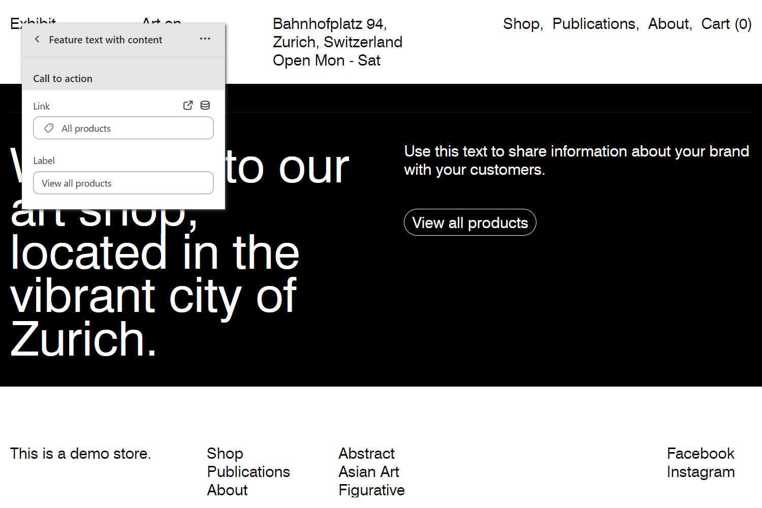
The previous image shows a Feature text with content section on a store's Homepage. In the upper left, part of the Theme editor section menu is displayed. In the menu, the Call to action options specify a link and label text for the section's button. On the right, the section displays a View all products button.
For general guidance with modifying sections, refer to Sections overview, and Shopify help: Sections and blocks.
Set up a Feature text with content section
To set up a Feature text with content section:
Go to Customize theme.
At the top of the page, use the dropdown to select a template that contains a Feature text with content section.
Note
The section can be added into any page, except Checkout and Giftcard pages. To add the section into the current page, select Add section > Feature text with content. Refer to Shopify help: Add a section.
From the side menu, select Feature text with content.
Select a setting described in the following table.
| Setting name | Description |
|---|---|
| Feature text > Text | In the Text box, enter text to display as "feature" text inside the section. Format the text and add links using the Text editor pane. |
| Feature text > Text > Insert dynamic source | To display feature text from a dynamic source, select the Insert dynamic source icon beside the Text box, and then choose a metafield to add. Refer to Shopify help: Metafields. |
| Feature text > Text font | Select the Text font radio buttons to set a font for feature text inside the section. The font options are Body or Heading. |
| Feature text > Desktop font size scale | Adjust the slider Desktop font size scale to set a font size for the section's feature text on desktop display devices. The minimum value is -2 and the maximum is 7. |
| Feature text > Mobile font size scale | Adjust the slider Mobile font size scale to set a font size for the section's feature text on mobile display devices. The minimum value is -2 and the maximum is 4. |
| Feature text > Position on desktop | Use the dropdown Position on desktop to align the section's feature text area the Left, Center, or Right. This setting applies to desktop display devices. |
| Feature text > Feature text width on desktop | Use the dropdown Feature text width on desktop to set a width for the section's feature text area. The options are Full width, Two thirds (2/3), One half (1/2), and One third (1/3). This setting applies to desktop display devices. |
| Content > Text | In the Text box, enter text to display as "content" text inside the section. Format the text and add links using the Text editor pane. |
| Content > Text > Insert dynamic source | To display content text from a dynamic source, select the Insert dynamic source icon beside the Text box, and then choose a metafield to add. Refer to Shopify help: Metafields. |
| Call to action > Link | In the Link box, enter a URL for the section's (optional) button to use or select a link to store page. To remove a link, select the X icon inside the link box. To visit the link, select the Visit link icon above the Link box. |
| Call to action > Link > Insert dynamic source | To display a link from a dynamic source, select the Connect dynamic source icon beside the Link box, and then choose a metafield to add. Refer to Shopify help: Metafields. |
| Call to action > Label | In the Label box, enter text to display as a label for the section's (optional) button. To use this setting, add a URL or select a store page in the Link box. |
| Call to action > Label > Insert dynamic source | To display button label text from a dynamic source, select the Connect dynamic source icon beside the Label box, and then choose a metafield to add. Refer to Shopify help: Metafields. |
| Layout > Show top border | Select the Show top border checkbox to show/hide a border at the top of the section. This setting does not apply when the section's content area is set to full width. |
| Color > Color scheme | Use the Change dropdown to set the section's color scheme to Scheme 1 or Scheme 2. Select Edit to configure the current color scheme. Refer to Colors. |
| Color > Theme settings (link) | Follow the Theme settings link to access the Theme settings > Colors menu in Theme editor. Use the Colors menu to set how colors are displayed throughout your store. |
| Spacing > Space above | Move the Space above slider to adjust the amount of empty (white) space displayed above the section. The slider ranges from 0x (times) to 2x. |
| Spacing > Space below | Move the Space below slider to adjust the amount of empty (white) space displayed below the section. The slider ranges from 0x (times) to 2x. |
| Theme settings (if available) | Select Theme settings to access additional settings for the section. Refer to Section theme settings menu. |
| Custom CSS | Select Custom CSS. In the box, enter custom CSS styles to apply only to the current section. Refer to Shopify help: Add custom CSS. To apply custom styles to your entire online store, refer to Theme settings > Custom CSS. |
| Remove section | Select Remove section to delete the section from the current page. |