Appearance
Layout
This guide describes the Theme settings > Layout menu options.
Use the settings to define page margins, specify grid widths, and configure the spaces between areas of content throughout your store. Refer to Shopify help: Layout.
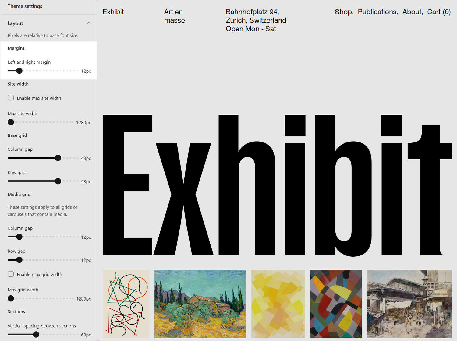
In the previous image, on the left side, the Theme settings > Layout menu is displayed. The menu's Left and right margin slider is set to 12px (pixels). The slider sets a size for the page margins. Page margins are the empty or "white" space that's displayed on the left and right side of very store page. On the right side of the image, a store's Homepage is displayed in Theme editor. On the Homepage, the page margin slider setting is applied to frame the page's content.
For general guidance with adjusting a theme setting, refer to Settings overview and Shopify help: Theme settings.
Configure a layout
To configure a layout for margins, grid widths and spacing:
Go to Theme settings > Layout.
Select a setting described in the following table.
Note
All pixel values in the Layout menu are relative to the size of your base font. To set a size for your base font, refer to Typography.
| Setting name | Description |
|---|---|
| Margins > Left and right margin | Adjust the slider Left and right margin to set a size for page margins between 4px and 64px (pixels). Margins frame your content using empty or "white" space that's displayed on the left and right side of very store page. |
| Site width > Enable max site width | Select the Enable max site width checkbox to turn on/off using the Max site width slider value as a maximum width for your store's pages. To use this setting, set the checkbox to on, and then adjust the Max site width slider to specify a maximum page width. |
| Site width > Max site width | Adjust the Max site width slider to specify a maximum width for your store's pages between 1280px and 2560px (pixels). To use this setting, set the Enable max site width checkbox to on. |
| Base grid > Column gap | Adjust the Column gap slider to set a size for the space or "gap" displayed between columns. This setting applies to the tiles displayed inside sections that use a grid layout. The slider ranges between 4px and 64px (pixels). Refer to Customize grid layouts. |
| Base grid > Row gap | Adjust the Row gap slider to set a size for the space or "gap" between rows. This setting applies to the tiles displayed inside sections that use a grid layout. The slider ranges between 4px and 64px (pixels). Refer to Customize grid layouts. |
| Media grid > Column gap | Adjust the Column gap slider to set a size for the space or "gap" between columns. This setting applies to all media grids. Media grids are grid and carousel sections that contain media. The slider ranges between 4px and 64px (pixels). Refer to Customize grid layouts. |
| Media grid > Row gap | Adjust the Row gap slider to set a size for the space or "gap" between rows. This setting applies to all media grids. Media grids are grid and carousel sections that contain media.The slider ranges between 4px and 64px (pixels). Refer to Customize grid layouts. |
| Media grid > Enable max grid width | Select the Enable max grid width checkbox to turn on/off using the Max grid width slider value as a maximum width for the media grids displayed on your store's pages. To use this setting, set the checkbox to on, and then adjust the Max grid width slider to specify a maximum grid width. This setting applies to all media grids. Media grids are grid and carousel sections that contain media. Refer to Customize grid layouts. |
| Media grid > Max grid width | Adjust the Max grid width slider to specify a maximum width for your store's media grids between 1280px and 2560px (pixels). To use this setting, set the Enable max grid width checkbox to on. This setting applies to all media grids. Media grids are grid and carousel sections that contain media. Refer to Customize grid layouts. |
| Sections > Vertical spacing between sections | Adjust the slider Vertical spacing between sections to set a size for the vertical, empty or "white" space displayed between sections of content. The slider ranges from 16px to 128px. |
| Sections > Inset sections that do not use the primary color scheme | Select the checkbox Inset sections that do not use the primary color scheme to turn on/off inset mode. With inset mode enabled:
|
| Sections > Section title desktop layout | Select the radio buttons Section title desktop layout to set a default display style for section title text. The options are Left when possible and Always above. This setting applies to desktop display devices. |