Appearance
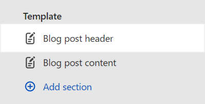
Blog post header
This guide describes setting up the Blog post header section.
Use the section to set how (article) header content displays on a blog post (article) page.
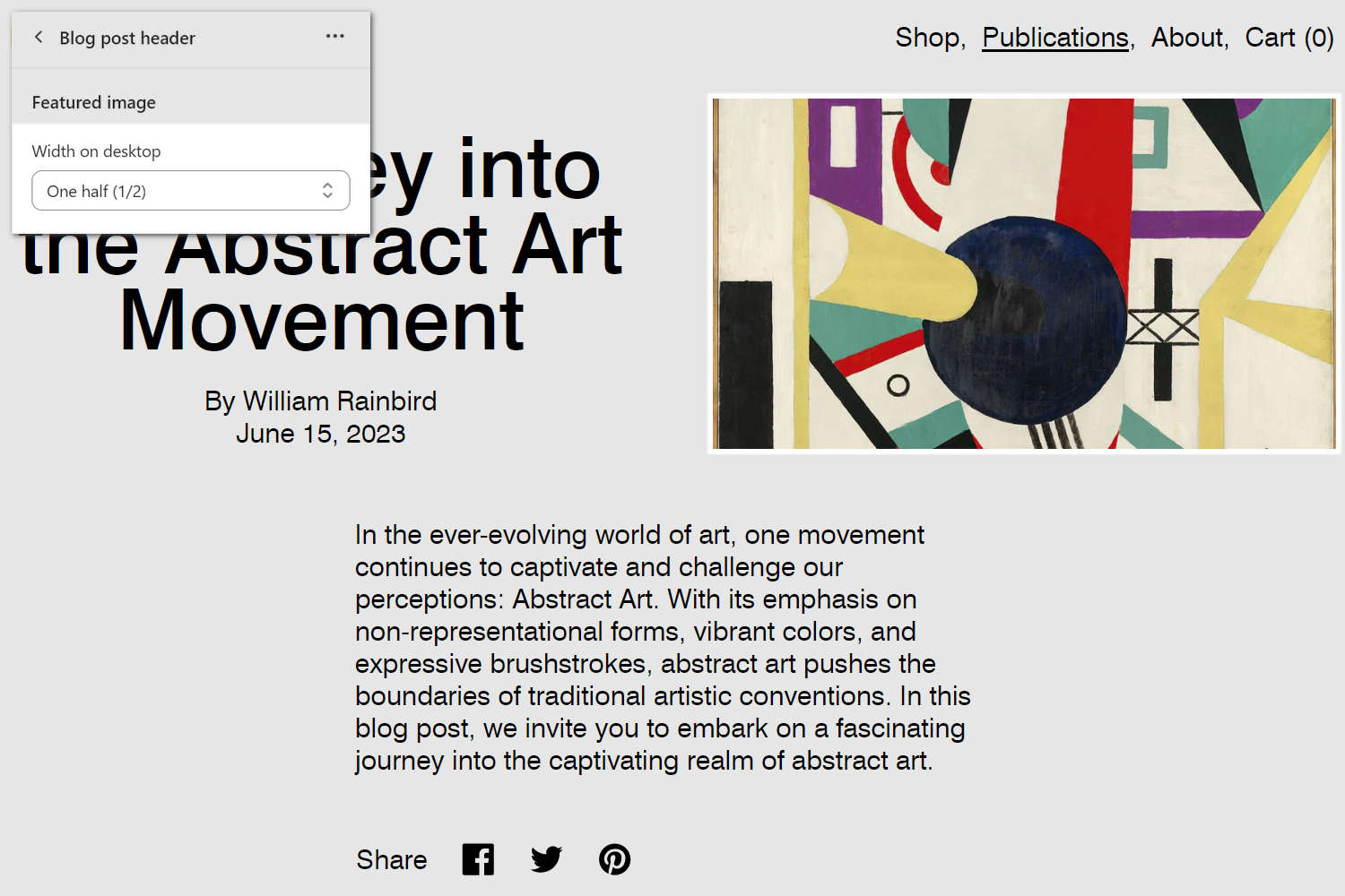
The previous image shows a Blog post header section on a Blog post (article) page. In the upper left, part of the Theme editor section menu is displayed. In the menu, the Width on desktop dropdown is set to One half (1/2). The dropdown setting specifies a width for the section's (featured) image.
For general guidance with modifying sections, refer to Sections overview, and Shopify help: Sections and blocks.
Set up a Blog post header section
To set up a Blog post header section:
Go to Customize theme.
In Theme editor, at the top of the page, use the dropdown to select the Blog posts > Default blog post page template.
Note
The section is available only on the Blog posts > Default blog post page template.
From the side menu, select Blog post header.
Select a setting described in the following table.
| Setting name | Description |
|---|---|
| Featured image > Width on desktop | Use the dropdown Width on desktop to set a width for the section's featured image. The options are:
|
| Featured image > Aspect ratio | Use the Aspect ratio dropdown to set a width-to-height ratio for featured images inside the section. This setting applies to desktop display devices. The options are: Natural, Square (1:1), Landscape (4:3), Portrait (2:3), Widescreen (16:9), Cinematic (2.35:1), and Ultrawide (3.5:1). |
| Featured image > Position on desktop | Select the Position on desktop radio buttons to position the section's featured images to the Left or Right side. This setting applies to desktop display devices. |
| Featured image > Enable full bleed | Select the Enable full bleed checkbox to turn on/off "Full bleed" mode. With this setting enabled, the section fills the entire page to the outer edges (or "bleed" area). |
| Content > Show author | Select the Show author checkbox to show/hide the name of each blog article's writer, inside the section. |
| Content > Show date | Select the Show date checkbox to show/hide each blog article's posting date, inside the section. |
| Content > Show tags | Select the Show tags checkbox to show/hide tags associated with the blog article, inside the section. Refer to Shopify help: Creating and using tags in Shopify. |
| Layout > Text alignment | Use the Text alignment dropdown to align text inside the section to the Left, Center, or Right. |
| Layout > Align content | Use the Align content dropdown to align content items inside the section to the Top, Center or Bottom. |
| Color > Color scheme | Use the Change dropdown to set the section's color scheme to Scheme 1 or Scheme 2. Select Edit to configure the current color scheme. Refer to Colors. |
| Color > Color scheme > Theme settings (link) | Follow the Theme settings link to access the Theme settings > Colors menu in Theme editor. Use the Colors menu to set how colors are displayed throughout your store. |
| Spacing > Above | Move the Above slider to adjust the amount of empty or "white" space displayed above the section. The slider ranges from 0x (times) to 2x. |
| Spacing > Below | Move the Below slider to adjust the amount of empty or "white" space displayed below the section. The slider ranges from 0x (times) to 2x. |
| Theme settings | Select Theme settings to access additional settings for the section. Refer to Section theme settings menu. |
| Custom CSS | Select Custom CSS. In the box, enter custom CSS styles to apply only to the current section. Refer to Shopify help: Add custom CSS. To apply custom styles to your entire online store, refer to Theme settings > Custom CSS. |