Appearance
Product grid - collection
This guide describes setting up the Product grid - collection section.
Use the section to display a grid on a Collection page that contains products (image tiles) from a collection.
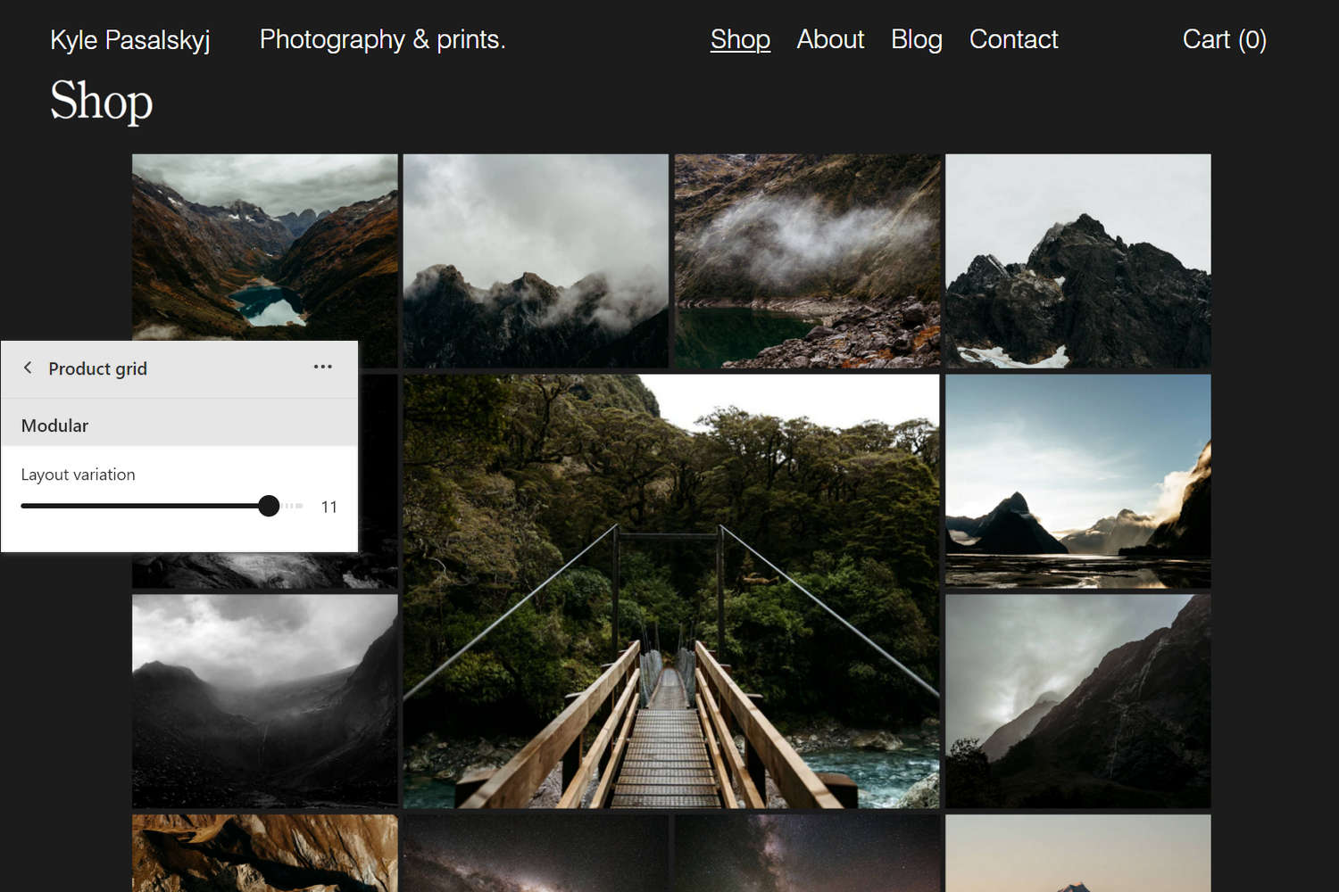
The previous image shows a Product grid - collection section on a store's Collection page. In the center left, part of the Theme editor section menu is displayed. The menu's Layout variation slider is set to 11. The slider sets a variation style for the product tiles inside section's Modular grid layout.
For general guidance with modifying sections, refer to Sections overview, and Shopify help: Sections and blocks.
Set up a Product grid section
To set up a Product grid section:
Go to Customize theme.
At the top of the page, use the dropdown to select the Collections > Default collection page template.
Note
The section is available only on the Collections > Default collection page template.
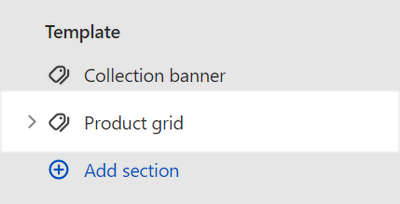
From the side menu, select Product grid.
Select a setting described in the following table.
| Setting name | Description |
|---|---|
| Maximum number of products per page | Adjust the slider Maximum products to show to set the total maximum number of products from a collection to display on each page inside the section. The slider ranges from 2 to 50. |
| Collection menu > Menu | Use the Menu selector to set up a menu inside the section. Refer to Set up a Collection menu. |
| Layout > Grid type | Use the Grid type dropdown to select a grid layout for the section to use. The options are Standard, Masonry, Justified, Modular, and Irregular. Refer to Customize Grid layouts. |
| Layout > Mobile columns | Use the Mobile columns dropdown to set the section's grid to display 1 or 2 columns. This setting applies to mobile display devices. Refer to Customize Grid layouts. |
| Layout > Number of columns on desktop | Adjust the slider Number of columns on desktop to set the number of columns for section's grid to display. The slider ranges from 1 to 6. This setting applies to desktop display devices, and does not apply if the Grid type option is set to Modular or Irregular. Refer to Customize Grid layouts. |
| Standard > Alignment of items | Use the Alignment of items dropdown to align items inside the section's Standard grid layout to the Top, Baseline, Center, or Bottom. Refer to Customize Grid layouts. To use this option, set the Grid type dropdown to Standard. |
| Modular > Layout variation | Adjust the Layout variation slider to set a variation style for the section's Modular grid layout. The slider ranges from 1 to 12. Refer to Customize Grid layouts. To use this option, set the Grid type dropdown to Modular. |
| Modular > Grid base aspect ratio | Adjust the slider Grid base aspect ratio to set a width-to-height ratio for the tiles or "modules" inside the section's Modular grid layout. To use this option, set the Grid type dropdown to Modular. The slider ranges from 0.5:1 (wide) to 1.8:1 (tall). Setting a lower aspect ratio creates landscape-style tiles, and a higher aspect ratio creates portrait-style tiles. For square shaped modules, use the 1:1 default aspect ratio setting. |
| Modular > Do not crop media on mobile | Select the Do not crop media on mobile checkbox to turn on/off media cropping for media inside the section's Modular grid layout. This setting applies to mobile display devices. To use this option, set the Grid type to Modular. |
| Irregular > Layout variation | Adjust the Layout variation slider to set a variation style for the section's Irregular grid layout. The slider ranges from 1 to 15. Refer to Customize Grid layouts. To use this option, set the Grid type dropdown to Irregular. |
| Irregular > Alignment of items | Use the Alignment of items dropdown to set a position for items inside the section's Irregular grid layout. Refer to Customize Grid layouts. The options are:
|
| Media > Aspect ratio | Use the Aspect ratio dropdown to set a width-to-height ratio for media item tiles inside the section's grid layout. The options are: Natural, Square (1:1), Landscape (4:3), Portrait (2:3), and Widescreen (16:9) To use this option, set the Grid type to Standard or Irregular. Refer to Customize Grid layouts. |
| Media > Maximize size | Select the Maximize size checkbox to turn on/off maximized images for media item tiles inside the section. With maximized images enabled, images fill the available space inside the section's media item tiles. Maximized images are not displayed if the Aspect ratio option is set to Natural. To use this option, set the Grid type to Standard or Irregular. Refer to Customize Grid layouts. |
| Labels > Show titles | Select the Show titles checkbox to turn on/off title labels for tiles inside the section. With this option enabled, each tile displays a text label containing a collection's title (name). |
| Labels > Show prices | Select the Show prices checkbox to turn on/off price labels for tiles inside the section. With this option enabled, each tile displays a text label containing a product's price. |
| Labels > Display | Use the Display dropdown to set how labels for tiles are displayed inside the section. The options are Below media, Text overlay on hover, and Follow mouse on hover. Refer to Overlay labels. |
| Labels > Display > Theme settings (link) | Follow the Theme settings link to access your store's Theme settings > Overlay labels menu in Theme editor. Use the menu to configure Exhibit's Overlay labels feature. Refer to Overlay labels. |
| Labels > Show vendor | Select the Show vendor checkbox to turn on/off vendor labels for tiles inside the section. With this option enabled, a text label containing a product's vendor name displays below each tile. To use this option, set the Display dropdown to Below media. |
| Labels > Always show labels on mobile | Select the checkbox Always show labels on mobile to always show/hide labels inside the section on mobile display devices. |
| Product tiles > Quick view | Use the Quick view dropdown to set how Exhibit's Quick view feature is displayed inside the section. The options are Disabled (off), Enabled on Desktop, and Enabled on Mobile and Desktop. Use the Quick view feature to provide store visitors with quick access to a collection's products from inside the section. Refer to Quick view. |
| Product tiles > Text alignment | Use the Text alignment options to align text inside the section's product tiles to the Left or Center. |
| Color > Color scheme | Use the Change dropdown to set the section's color scheme to Scheme 1 or Scheme 2. Select Edit to configure the current color scheme. Refer to Colors. |
| Color > Theme settings (link) | Follow the Theme settings link to access the Theme settings > Colors menu in Theme editor. Use the Colors menu to set how colors are displayed throughout your store. |
| Spacing > Above | Move the Above slider to adjust the amount of empty or "white" space displayed above the section. The slider ranges from 0x (times) to 2x. |
| Spacing > Below | Move the Below slider to adjust the amount of empty or "white" space displayed below the section. The slider ranges from 0x (times) to 2x. |
| Spacing > Disable left and right margins | Select the checkbox Disable left and right margins to show/hide the empty or "white" space displayed on the left and right sides of the section. |
| Spacing > Remove grid gaps | Select the Remove grid gaps checkbox to show/hide the empty or "white" space displayed around each item inside the section's grid layout. |
| Theme settings | Select Theme settings to access additional settings for the section. Refer to Section theme settings menu. |
| Custom CSS | Select Custom CSS. In the box, enter custom CSS styles to apply only to the current section. Refer to Shopify help: Add custom CSS. To apply custom styles to your entire online store, refer to Theme settings > Custom CSS. |
Set up a Collection menu
To set up a menu inside Product grid section, apply the following settings in Product grid > Collection menu > Menu.
If the section has no menu, to select a menu, choose Select menu. Enter the name of a menu into the Search box, or pick a menu from the list, and then choose Select.
To edit the current menu, select the Menu link. The link opens the Navigation menu editor in Shopify admin. Use the editor to modify the menu. Refer to Shopify help: Add, remove, or edit menu items in your online store.
To create a new menu, select Change > Change menu, and then follow the Create menu link. The link opens the Navigation > Add menu page in Shopify admin. Use the menu editor to create a new menu, and then the select the new menu. Refer to Shopify help: Add, remove, or edit menu items in your online store.
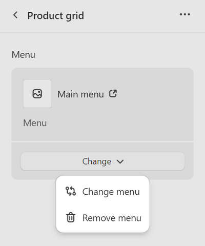
To replace the current menu, select Change > Change menu. Enter the name of the replacement menu into the Search box, or pick a replacement menu from the list, and then choose Select.
To delete the current menu, select Change > Remove menu.
Configure a block within a Product grid section
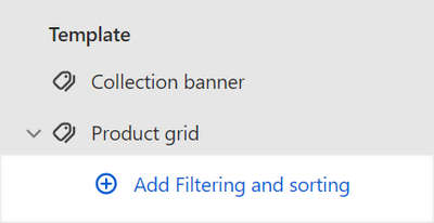
A default Product grid section contains a Filtering and sorting block. To configure a block inside the section:
Go to Customize theme.
At the top of the page, use the dropdown to select the Collections > Default collection page template.
Note
The section is available only on the Collections > Default collection page template.
From the side menu, expand the Product grid section menu.
To configure an existing block, select the block from the side menu.
To add a new block, select Add Filtering and sorting, and then select the block you added.
Note
Inside the section, you can add, remove, show/ hide, or move blocks. Refer to Configure blocks inside a section, and Shopify help: Sections and blocks.
Apply a block setting described in the following table.
| Setting name | Description |
|---|---|
| Desktop filter layout | Select the Desktop filter layout radio buttons to specify a layout for the block's filter controls. The options are Stacked (horizontal) and Drawer. This setting applies to desktop display devices. The Drawer option is the default layout for mobile display devices. |
| Stacked filter style | Select the Stacked filter style radio buttons to set a style for the block's stacked filter controls. The options are Text and Buttons. To use this option, set the Desktop filter layout radio buttons to Stacked (horizontal). |
| Filtering and sorting > Enable filtering | Select the Enable filtering checkbox to show/hide the product filtering options inside the block. If enabled, visitors can select a range of products within a collection by using filtering criteria like availability and price. Refer to Shopify help: Searching for products and filtering your product list and Shopify help: Add storefront filtering. |
| Filtering and sorting > Enable filtering > Customize filters | Follow the Customize filters link to open the page Navigation > Collection and search filters on your store's admin. Use the page to set up custom filters and navigation menus for your store's collections. Refer to Shopify help: Custom filters. |
| Filtering and sorting > Expand filters by default | Select the checkbox Expand filters by default to show/hide the product filtering options, by default, inside the block. With this option set to off, to access the product filtering options, visitors must select the Filter button inside the block. |
| Filtering and sorting > Show filter counts | Select the checkbox Show filter counts to show/hide a count of the number of products in each filter category, inside the block. A count is displayed beside the name of each filter. For example, for a collection containing two products that are in stock, In stock (2) is displayed in the Availability filter area. |
| Filtering and sorting > Enable color swatch filters | For products in a collection that use color variants, select the checkbox Enable color swatch filters to show/hide the option to filter products by color, inside the block. Refer to Shopify help: Variants and Shopify help: Searching for products and filtering your product list. |
| Filtering and sorting > Enable sorting | Select the checkbox Enable sorting to show/hide the product sorting options inside the block. If enabled, visitors can arrange the products in a collection by using sorting criteria like price and popularity. Refer to Shopify help: Collection layout and appearance. |
| Remove block | Select Remove block to delete the block from the current section. |