Appearance
Adjust text sizes
Baseline includes a quick and convenient system for maintaining consistent text sizes across your store.
Instead of setting text sizes for individual store elements and pages, Baseline allows you to specify text sizes for groups of text elements, like headings, that apply across page templates. Baseline's text size system also ensures your store's compatibility with a range of customer devices, like mobile and desktop, by resizing text according to each customer's screen size.
The following video demonstrates increasing the heading size for a store's featured collection.
Set the size of the base font
With Baseline's text size system, you set a size for the base font. Baseline then scales the size of the text elements throughout your store, relative to your chosen base font size.
To set the size of the base font, complete the following steps.
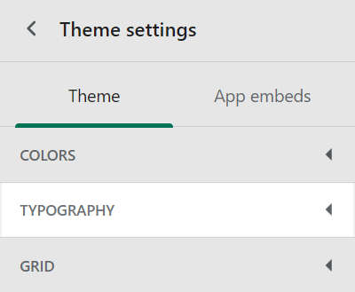
On your store's admin Theme settings page, select Typography.
In the Typography settings menu, locate the Base font size slider.
Adjust the Base font size slider to set a size for the base font in pixels or
px.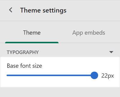
TIP
When you're finished adjusting the theme, to avoid losing unsaved changes, select Save at the top of the Theme settings menu.

Apply a text size to a group of headings
Baseline's text size system organizes your store's headings into groups. You specify a text size for each group. Baseline scales the headings in each group, relative to your chosen base font size.
To apply a text size to a group of headings, complete the following steps.
On your store's admin Theme settings page, select Typography.
In the Typography settings menu, locate the Heading sizes menu section.
Select the appropriate dropdown, and then choose a text size to apply.
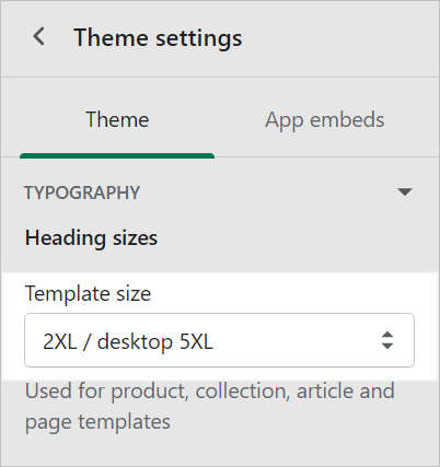
For example, in the following image, the text size 2XL/ desktop 5XL is selected from the Template size dropdown. For details about other options, refer below to Example: Available heading groups and text sizes.
Example: Available heading groups and text sizes
In Theme settings > Typography > Heading sizes, Baseline provides a dropdown for applying a text size to each group of headings. The heading groups are described in the following table:
| Heading group name | Description |
|---|---|
| Base size | Used for section titles and main section headings. |
| Template size | Applies to product, collection, article and page templates. |
| Secondary size | Used for the blog post grid, text columns with images and other secondary headings. |
For each dropdown, Baseline provides the following text size options:
- S = Small. Scales headings down to half the base font size.
- M = Medium. Scales headings to the base font size.
- L = Large. Scales headings to the base font size x 2.
- XL = Extra large. Scales headings to Large x 2.
- 2XL = 2 x extra large. Scales headings to Extra large x 2.
- 3XL = 3 x extra large. Scales headings to XL x 3.
- 4XL = 4 x extra large. Scales headings to XL x 4.
- 5XL = 5 x extra large. Scales headings to XL x 5.
- 6XL = 6 x extra large. Scales headings to XL x 6.
- 7XL = 7 x extra large. Scales headings to XL x 7.
Note
Some text sizes might be unavailable from each dropdown.
Set text sizes for mobile and desktop devices
For greater control over text sizes used by different devices and screen sizes, set distinct text sizes for mobile and desktop displays.
To set text sizes for mobile and desktop devices, complete the following steps.
On your store's admin Theme settings page, select Typography.
In the Typography settings menu, locate the Heading sizes menu section.
Select the appropriate dropdown, and then choose a text size to apply for mobile and desktop devices.
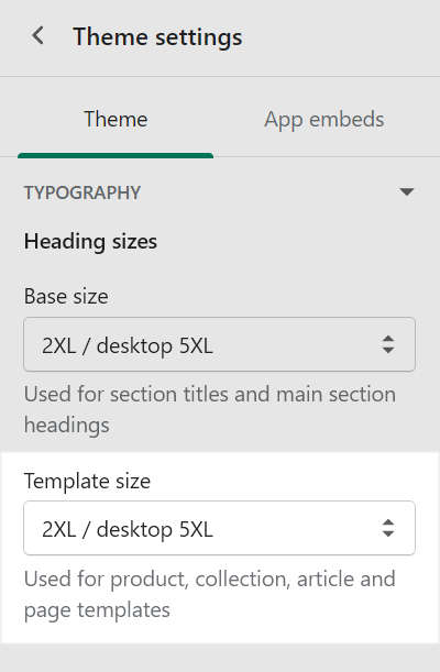
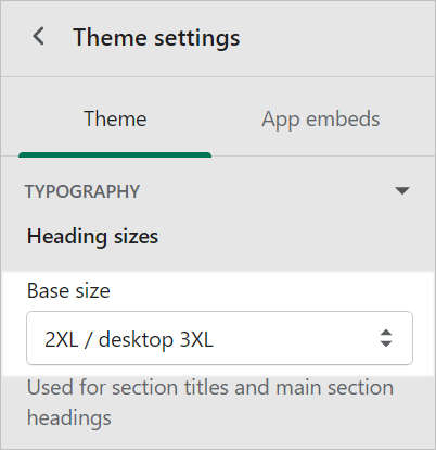
Where available, the dropdown options provide separate text sizes for mobile and desktop devices. For example, in the following image, the Base size dropdown is set to
2XLfor mobile device displays and3XLfor desktop displays.For another example, refer below to Example: Text sizes for mobile and desktop devices.
Note
Only certain text sizes are available within each display-size template setting. For example, sizes 3XL and above are only available with desktop-sized display templates.
Example: Text sizes for mobile and desktop devices
Using the example settings in the following image, Baseline's text size settings for mobile and desktop displays are:
2XLon mobile displays5XLon desktop displays