Appearance
Product pages
This guide describes setting up a Product pages section on your store's default product page. Use the section to set what's displayed when a visitor selects a product from your store. In addition to setting the contents of a product page, you can adjust the page's layout.
The following video shows a product pages section on a store's default product page. During the video, the option is set to Enable two images per row... inside the section. With an uneven number of product images, the first image displays at the full width of the image area because the checkbox Full width first image... is also enabled.
For general guidance with modifying sections, refer to Sections overview.
Set up a product pages section
To set up a product pages section:
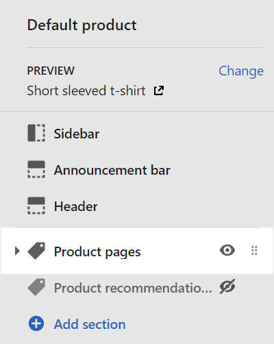
Go to Customize theme. At the top of the page, use the dropdown to select Products > Default product.
Note
The product pages section is available only on default product pages.
To add Content sections into the current page, select Add section, from the side menu, and then choose a section to add. Refer to Shopify help: Add a section.
From the side menu, select Product pages.
Select a section setting described in the following table.
To configure a block inside the section, refer to Configure a block within a product pages section.
| Section setting name | Description |
|---|---|
| Desktop image width | Select the dropdown Desktop image width to set a width for the image inside the section. This setting applies to desktop displays, and the dropdown options are: One third, One half, Three fifths, and Two thirds. The image and text tiles are resized accordingly. |
| Desktop image position | Select the dropdown Desktop image position to position the image to the Left or Right, inside the section. This setting applies to desktop displays. |
| Enable two images per row on desktop | Select the checkbox Enable two images per row on desktop to turn on/ off displaying two product images per row on desktop devices, in the image area inside the section. If there are an uneven number of images, the first image is displayed at the full width of the image area. |
| Full width first image on desktop | Select the checkbox Full width first image on desktop to turn on/ off displaying the first product image at the full width of the image area inside the section. This setting applies only if the option to display two images per row is enabled. |
| Variant image change behaviour | Use the dropdown Variant image change behaviour to set how images behave inside the section when a product variant is selected. When a variant is selected:
|
| Media > Enable image zoom | Select the checkbox Enable image zoom to show/ hide a panel that contains images of a product. The panel opens when a product's image is selected inside the section. The panel provides zoom in/out for images, arrow icons for navigating between images, and an X icon to close the panel. |
| Media > Enable video looping | Select the checkbox Enable video looping to turn on/ off continuous replay for videos inside the section. If this setting is set to off, the video plays once. Refer to Shopify help: Product media. |
| Color > Color scheme | Use the Color scheme dropdown to set the color scheme for the section to Primary, Secondary or Tertiary. Refer to Customize color schemes. |
| Use this color scheme for header and footer | Select the checkbox Use this color scheme for header and footer to turn on/ off applying the section's color scheme to the header and footer. This setting applies only to the product template/ default product page. |
| Theme settings | Select Theme Settings to access additional settings for the section. Refer to Section theme settings menu. |
Configure a block within a product pages section
To configure a block within a product pages section:
In Customize theme, at the top of the page, use the dropdown to select Products > Default product.
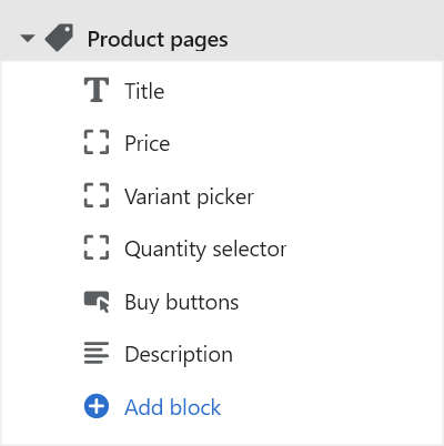
From the side menu, expand the Product pages section menu.
From the Product pages menu, select a block, and then apply the corresponding settings described in the Table: Product pages blocks.
To add a block into the product pages section, from the Product pages menu, select Add block, and then choose a block to add.
Note
Inside a product pages section, you can add, remove, show/ hide, or move blocks. Refer to Configure blocks inside a section, or Shopify help: Sections and blocks.
Table: Product pages blocks
The following table describes the blocks inside the product pages section, and their corresponding settings.
Some blocks have No customizable settings available, and blocks indicated with an asterisk * are contained in a standard product pages section. To configure a block, refer to Configure a block within a product pages section.
| Block name | Block description | Block setting(s) |
|---|---|---|
Title* | Displays a product's title, inside the section. | No customizable settings available. |
Price* | Displays a product's price, inside the section. | No customizable settings available. |
Variant picker* | Displays a variant picker for choosing variations of a product, inside the section. |
|
Quantity selector* | Displays a quantity selector, inside the section, for choosing the number of products to purchase. | No customizable settings available. |
Buy buttons* | Displays the Add to cart and Buy it now buttons, inside the section. |
|
Description* | Displays a text area to contain additional product information, inside the section. |
|
| Vendor | Displays the name of a product's vendor, inside the section. | No customizable settings available. |
| Share buttons | Displays an area with buttons for sharing links to your store's products via social media. | No customizable settings available. |
| Text | Displays a text area to contain additional product information, inside the section. |
|
| Rich text | Displays a formatted text area to contain additional product information, inside the section. |
|
| Collapsible tab | Displays a text area with expandable tabs, to contain additional product information, inside the section. |
|
| Icon list | Displays a list of items with icons, inside the section. |
|
| Pop-up | Displays a pop-up overlay to contain additional product information, inside the section. |
|