Appearance
Colors
This guide describes the Theme settings > Colors menu options to set how colors are used throughout your store.
In the following video, the button background color is changed in Theme settings > Colors > Buttons.
For general guidance with adjusting a theme setting, refer to Settings.
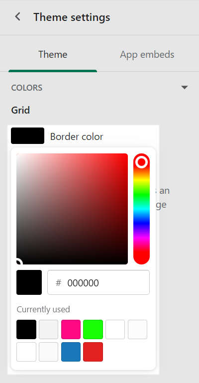
Grid (Border color)
To set a color for the grid border:
Go to Theme settings > Colors > Grid > Border color.
Select a color using the color picker, enter a hex color value or choose a Currently used color.
Refer to Configure the grid layout.
Primary color scheme
To set a color for text elements within the Primary color scheme:
Go to Theme settings > Colors > Primary color scheme.
Select one of the following text elements to colorize.
Text. Select a default color for text.
Background. Choose your store's background color.
Accent. Set a color for accented text, like hover over text and hyperlinks.
Secondary. Specify a color for secondary text, like social media share links.
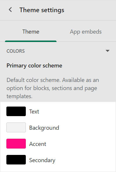
Select a color using the color picker, enter a hex color value or choose a Currently used color.
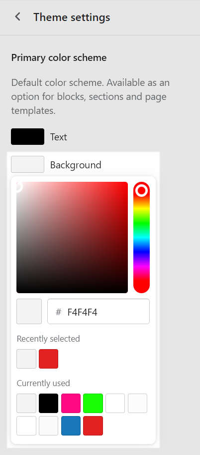
For example, in the following image, the Background color scheme element is selected.
Refer to Customize color schemes.
Secondary color scheme
Provides the Secondary color scheme with the same options as the Primary color scheme for Text, Background, Accent and Secondary colors.
Tertiary color scheme
Provides the Tertiary color scheme with the same options as the Primary color scheme for Text, Background, Accent and Secondary colors.
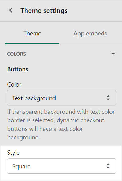
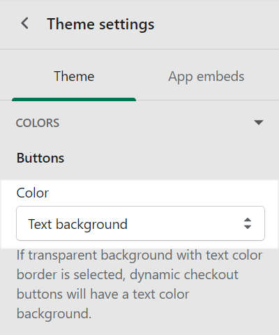
Buttons
To set a color and style for buttons:
Go to Theme settings > Colors > Buttons.
Use the Color dropdown to set the button colors to one of the following options:
Text background. Set the button background color to a color scheme's Text color.
Accent background. Set the button background color to a color scheme's Accent color.
Accent background with text border. Set the button background color to a color scheme's Accent color, and set the button border color to a color scheme's Text color.
Transparent background with text border. Set the button background color to a color scheme's Background color, and set the button border color a color scheme's Text color. Dynamic checkout buttons also use the Text color for the button background color.
Use the Style dropdown to set the button shape to Square, Slightly rounded or Rounded.